Website Redesign
The Plan Forward website redesign was a full-scale project aimed at improving the user experience, visual consistency, and overall brand presentation. I was responsible for redesigning the entire website in Figma, creating responsive breakpoints, building a reusable component library, and establishing a cohesive design system. Beyond the website, I developed marketing and brand materials, including one-pagers, infographics, social media assets, and a brand guidelines book. This project allowed me to translate research insights and organizational goals into an intuitive, visually engaging experience that communicates Plan Forward’s mission clearly to its audience.
Problem / Goal
The existing Plan Forward website had inconsistent branding, outdated UI patterns, and a fragmented layout that made it difficult for users to navigate and absorb the educational insights the platform provides. The goal was to redesign the website to create a cohesive, accessible, and engaging experience that clearly communicates the brand’s mission and supports user understanding.
Research / Insights
User feedback revealed several issues with the existing website: components were too large, mobile layouts appeared awkward, and color choices negatively impacted readability. Users found the overall design unprofessional and the graphics confusing, making it difficult to understand what the company does. These insights guided a redesign focused on clarity, readability, and professional visual presentation across all devices.
Design Process
I began with wireframes for the entire website, mapping layouts for desktop, tablet, and mobile breakpoints. From there, I created interactive prototypes to test layout and navigation flows. I built a component library with reusable buttons, cards, and callouts to ensure consistency across the site. Multiple iterations refined typography, spacing, and hierarchy to balance usability and visual appeal.
Solutions
The final redesign included a fully responsive website with a cohesive visual language, clear information hierarchy, and interactive elements that improve usability. A comprehensive design system was established to maintain consistency across all pages and future updates. Additional brand assets, including one-pagers, infographics, social media graphics, and a brand guidelines book, extended the visual identity beyond the website.
Impact / Learnings
The redesign created a more engaging and navigable experience, strengthening the clarity and professionalism of the Plan Forward brand. Qualitatively, users can now more easily access insights and resources, and the brand presents a unified visual identity across all touchpoints. Through this project, I refined my skills in end-to-end web design, responsive design, and creating scalable design systems that translate brand goals into user-friendly experiences.
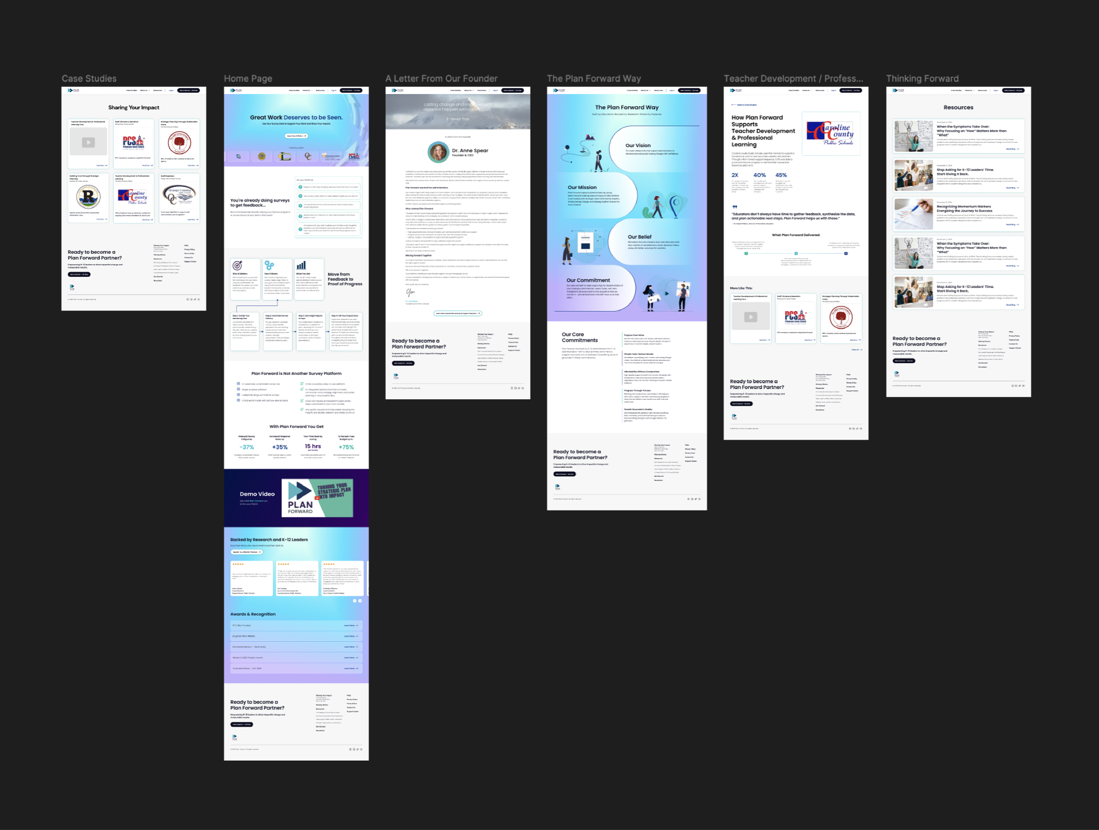
Homepage Wireframe
(click to expand)
(click to expand)
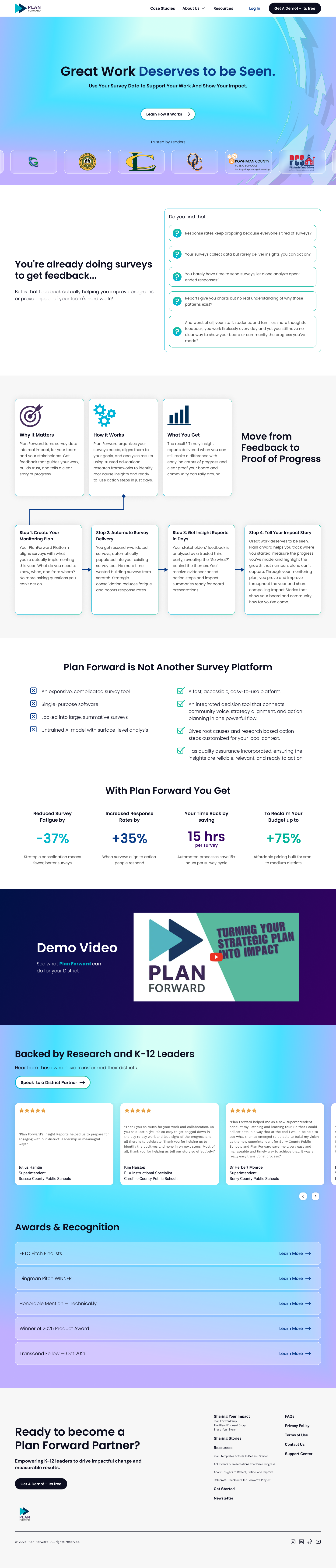
Building the Foundation
The homepage was a key part of the project since it shaped the overall look and feel. I refined the design multiple times to make sure the layout, messaging, and visuals felt clear, trustworthy, and easy to follow. I collaborated closely with the CEO to align the story and tone with the company’s mission, and partnered with the developer to ensure the design translated seamlessly into the build.
The homepage became the foundation for the full site design. I introduced a bright, inviting color palette that made the content feel approachable and optimistic while still maintaining a sense of trust and professionalism. Each hue was chosen to bring clarity and energy to a subject that could otherwise feel technical or data-heavy.
Modernizing the overall look was a key goal. I simplified the typography and focused on creating a smooth, cohesive flow between sections. Every element was designed to feel intentional, guiding users through the story without distraction.
I also built reusable components in Figma to keep consistency across pages and streamline collaboration as the project scaled. These design patterns made it easy to maintain alignment between visuals and messaging, ensuring every new page felt connected to the brand’s identity
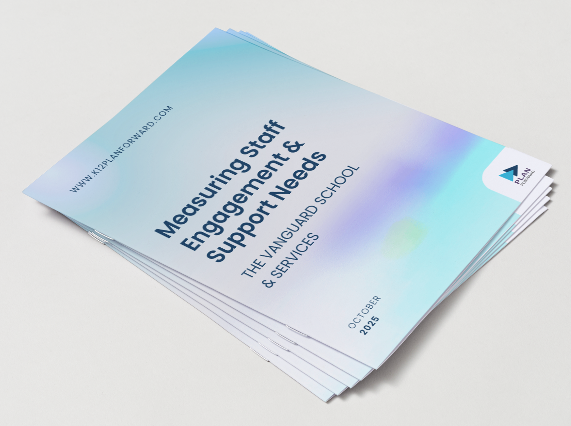
Marketing Material Refresh
To support Plan Forward’s broader brand refresh, I created a collection of marketing and communication materials, including one-pagers, infographics, business cards, and more. Each piece was designed to reflect the updated visual direction and maintain consistency.
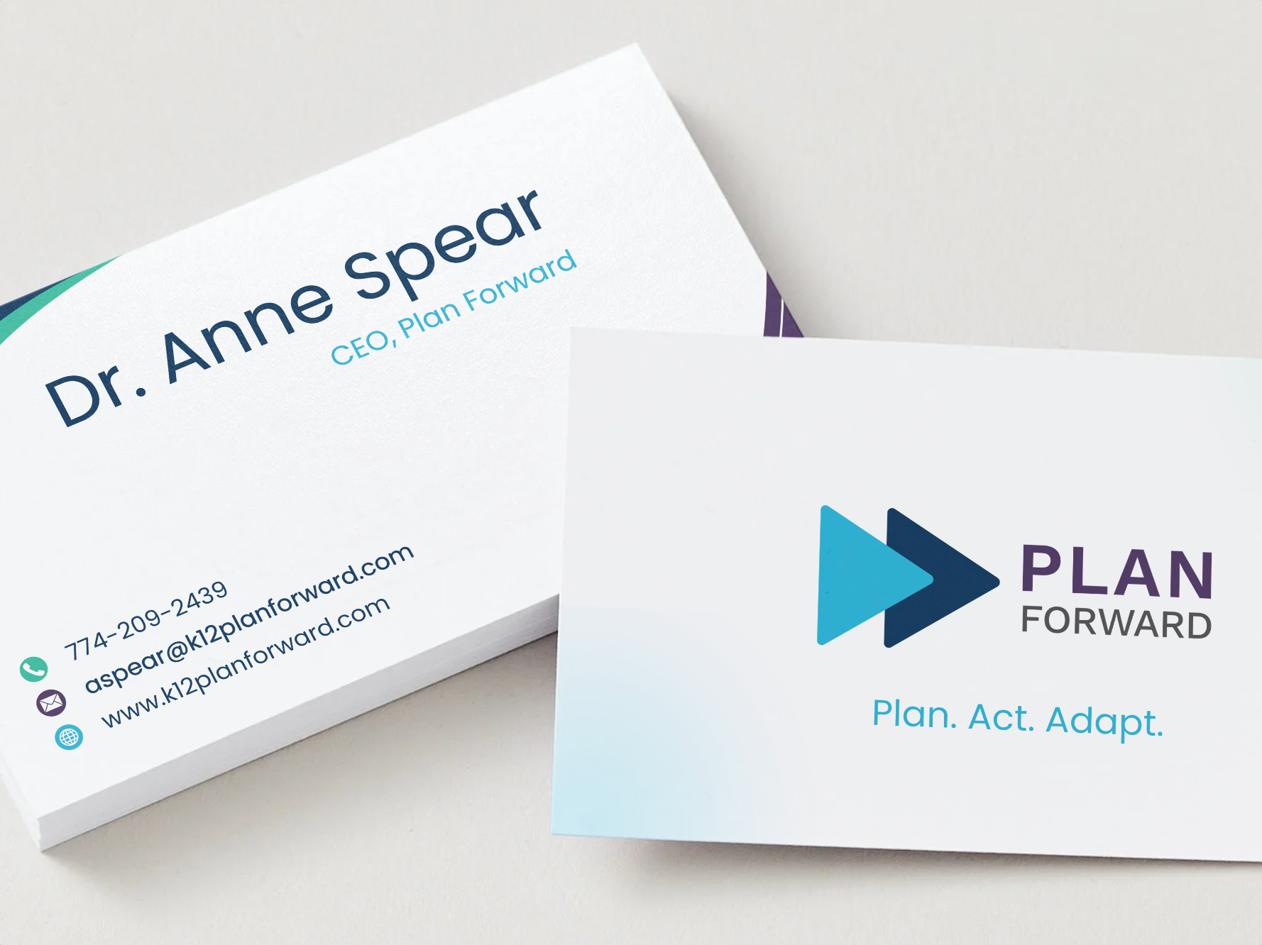
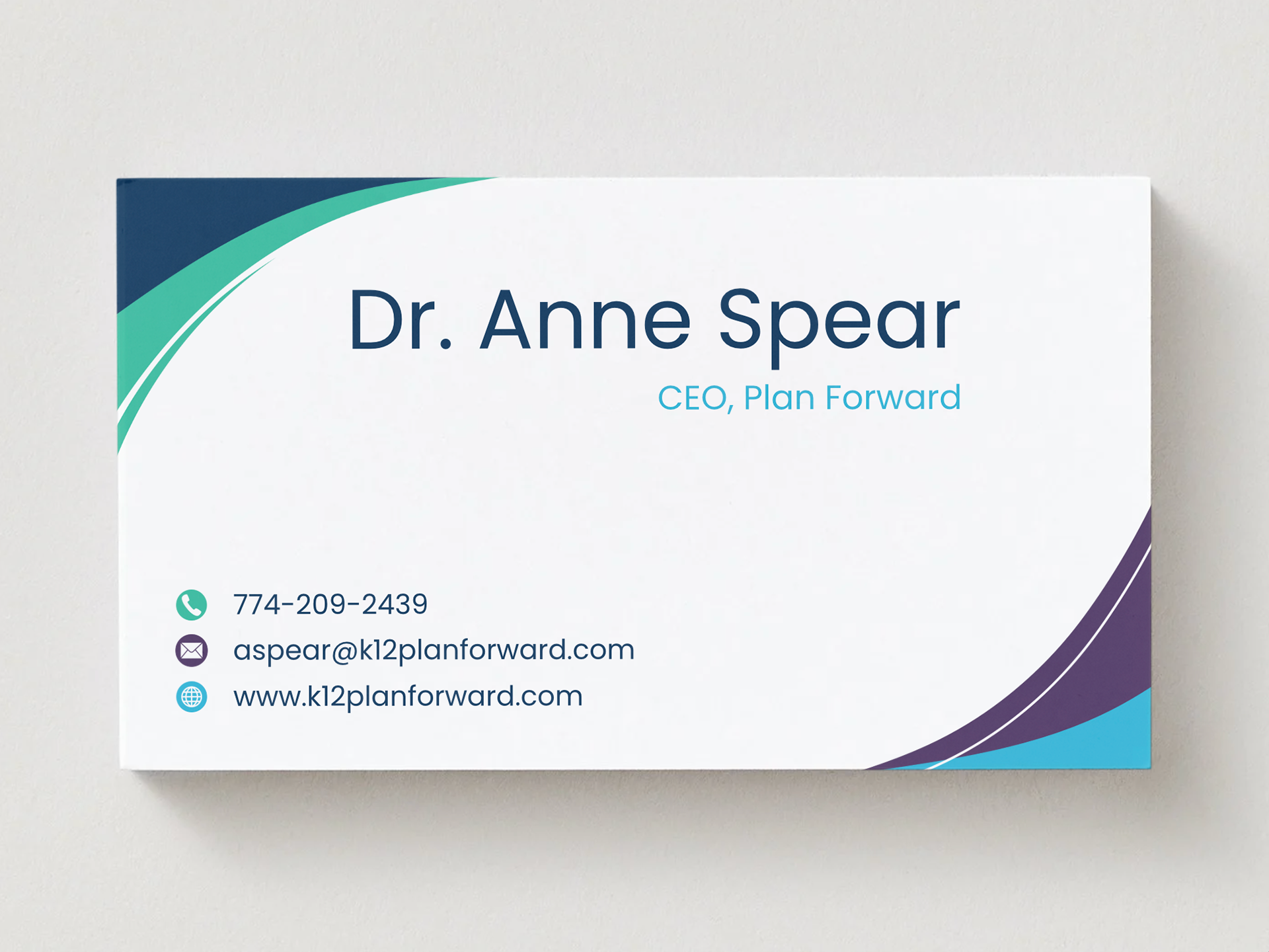
Business Cards
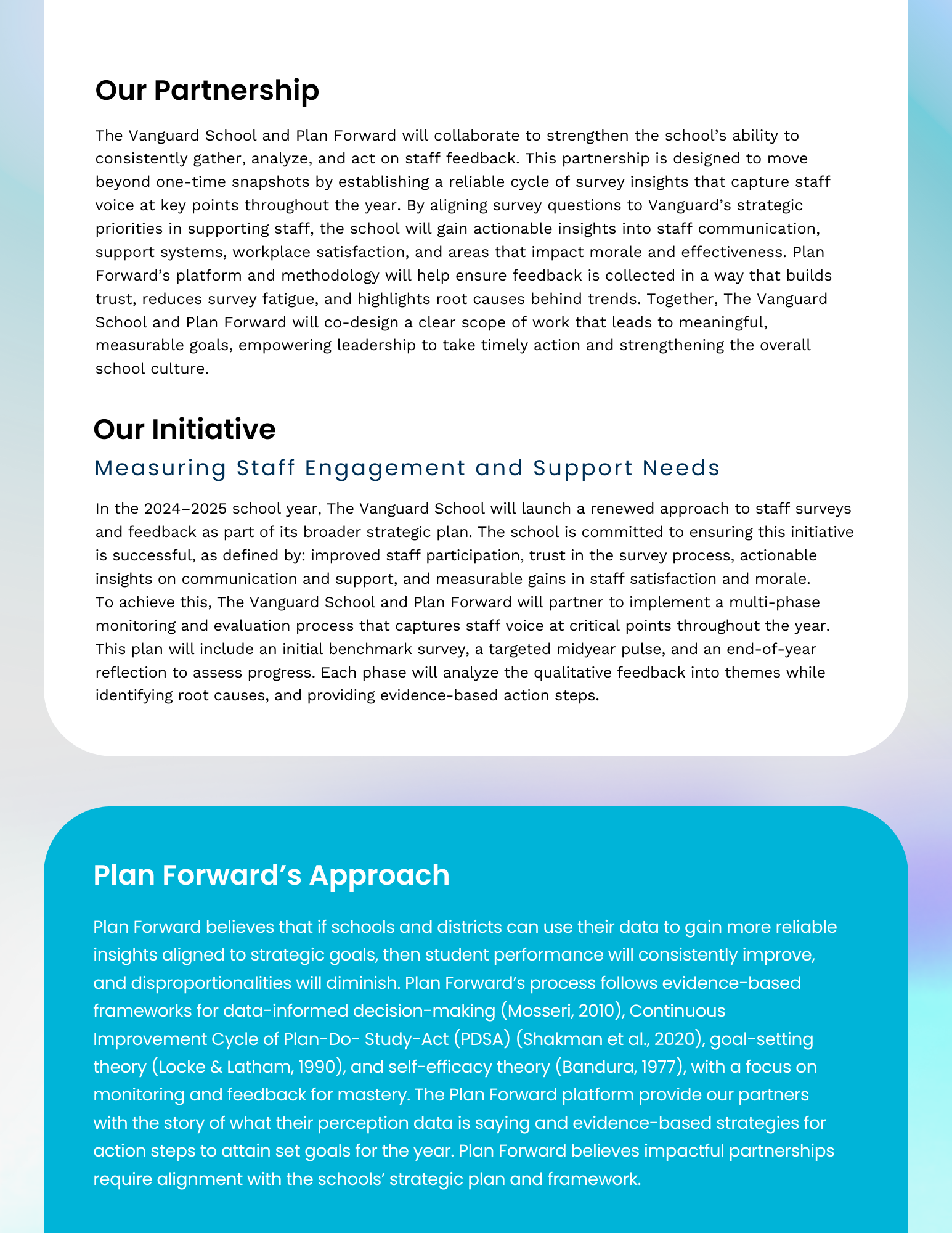
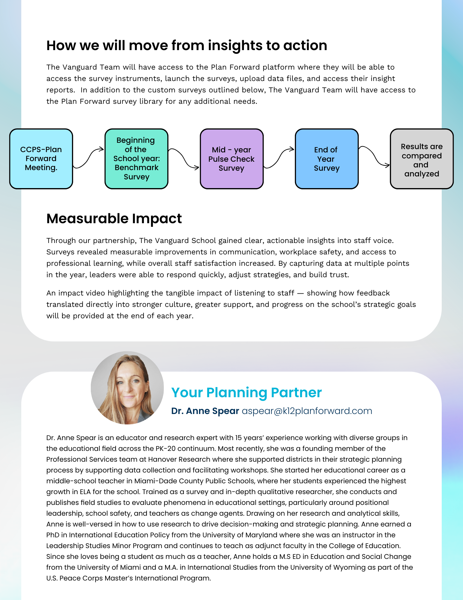
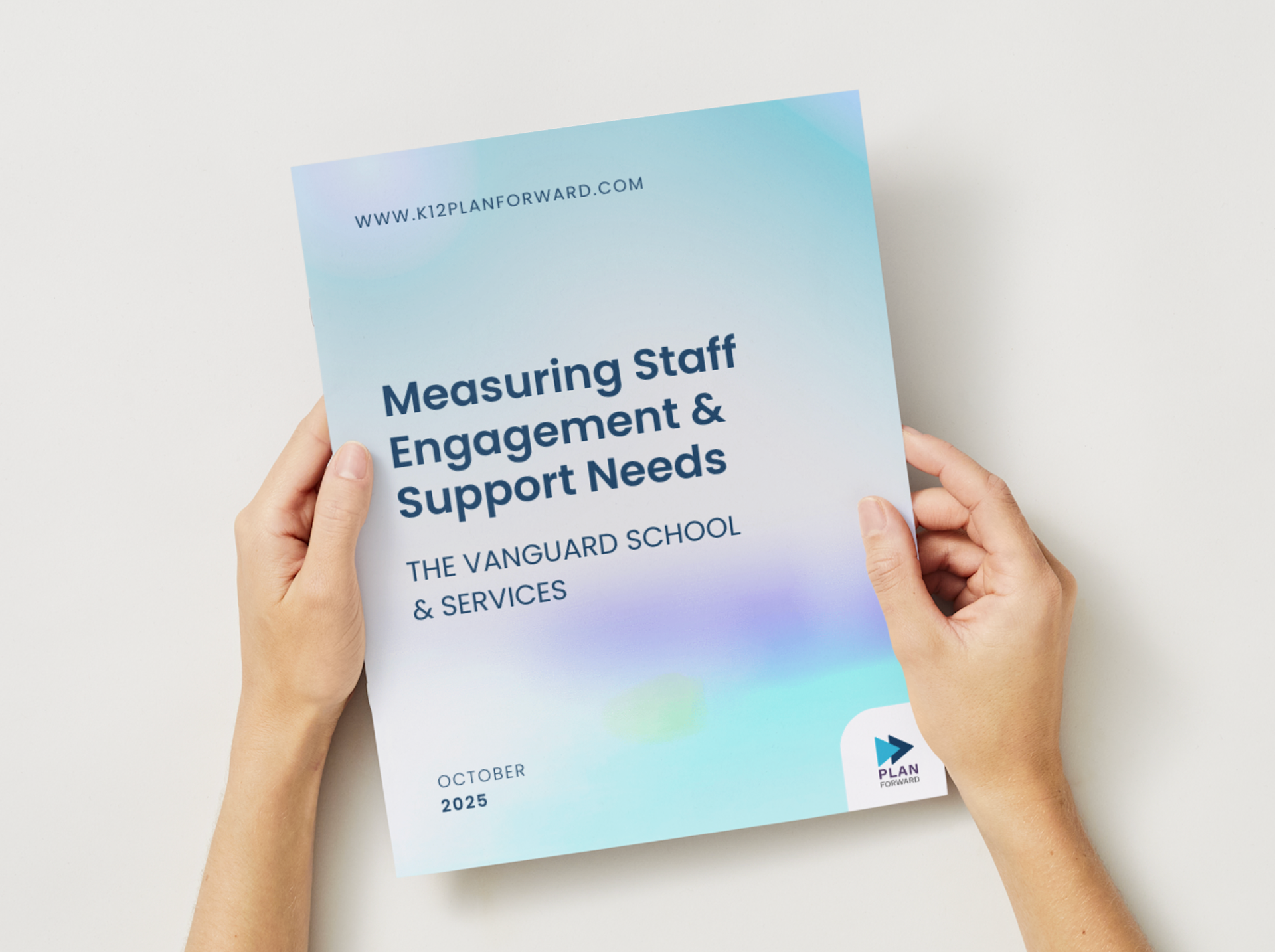
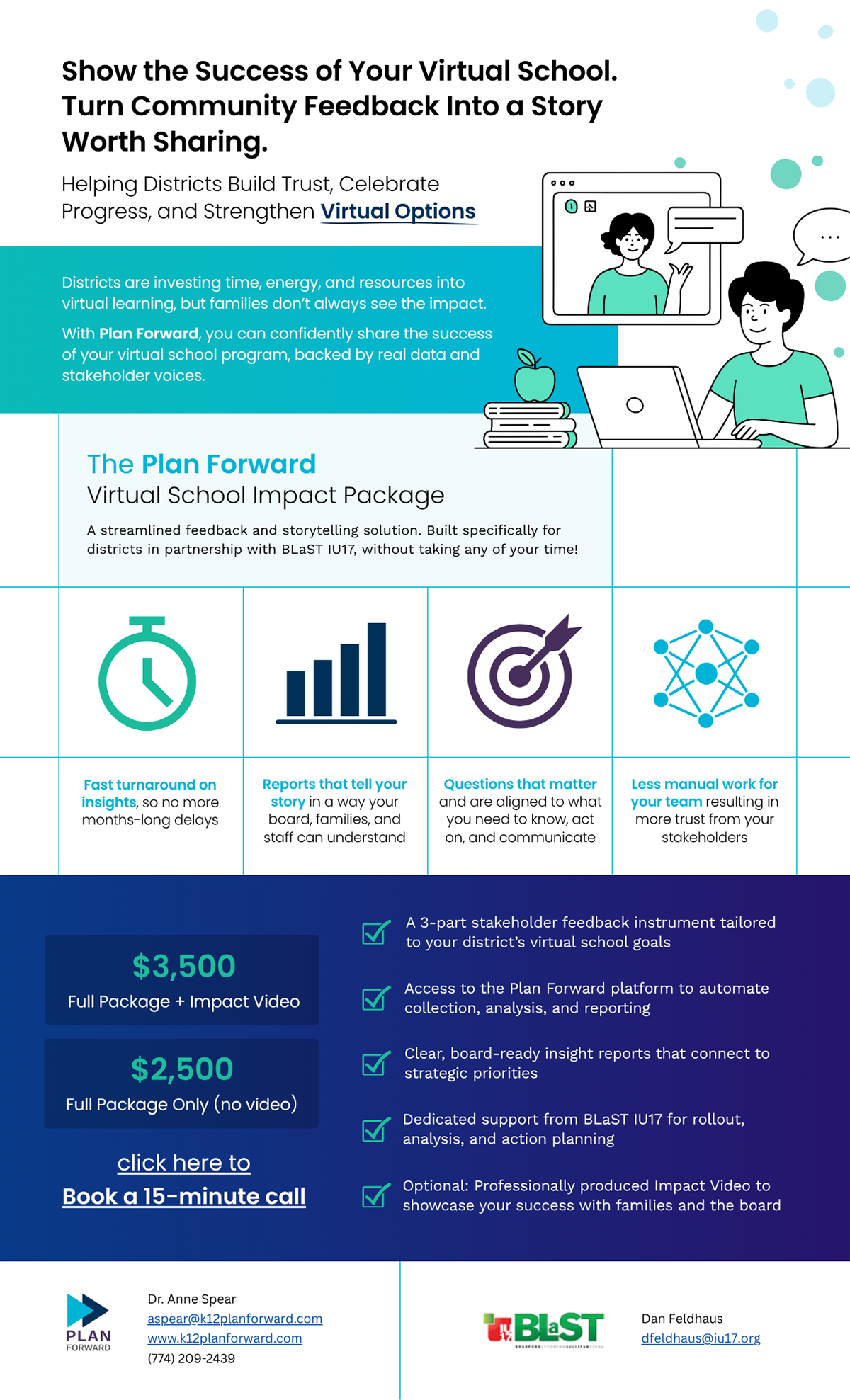
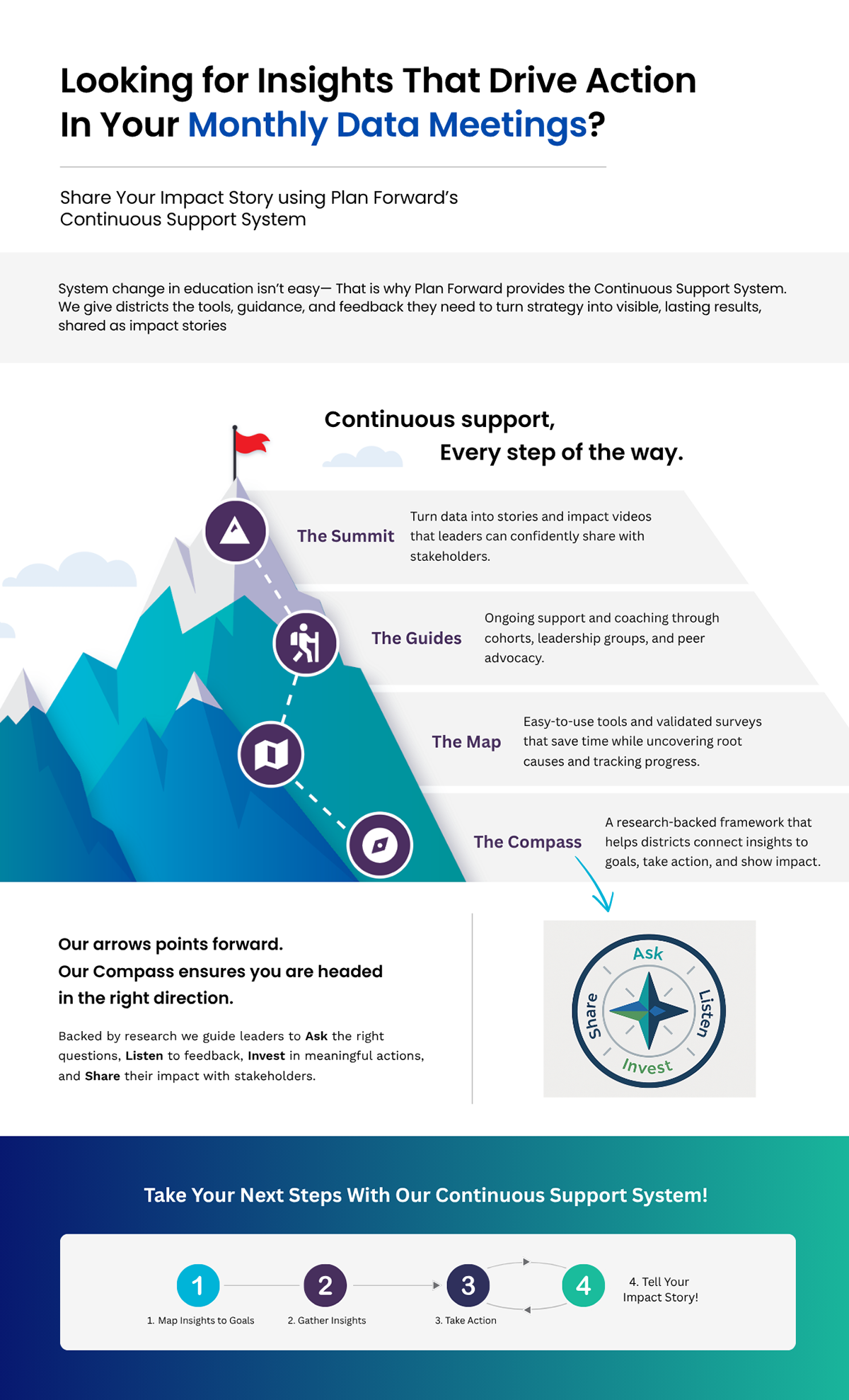
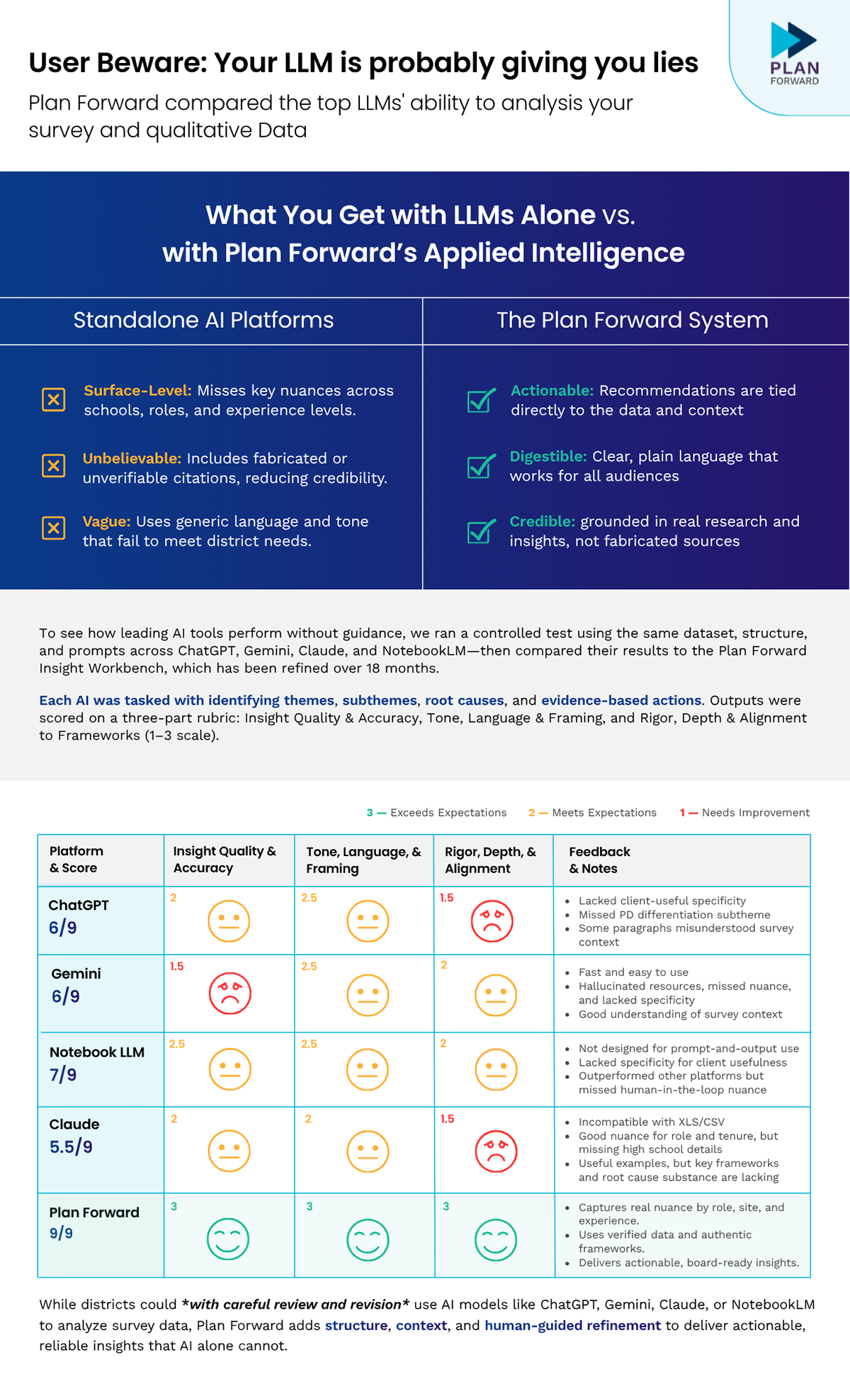
One Pagers / Infographics
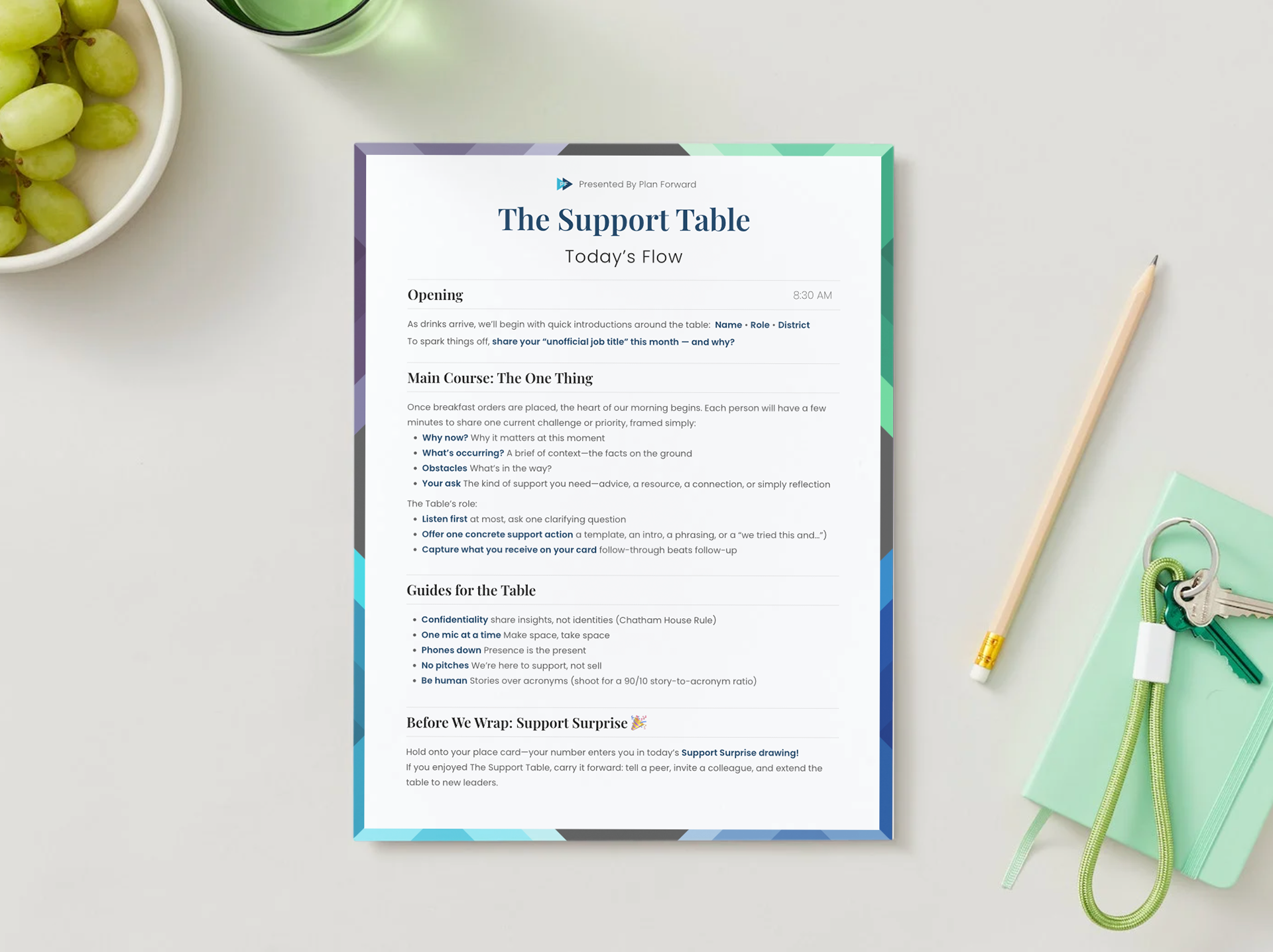
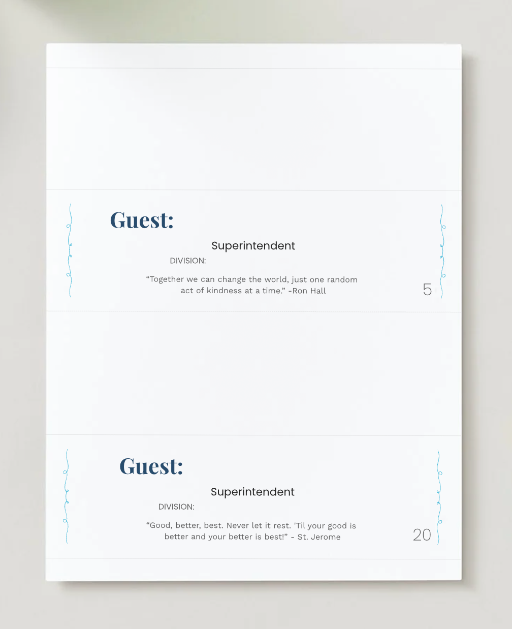
Agendas & Name Tags
Proposal Template