
The Lab 2
For the Office of Research Integrity (ORI), WILL Interactive was commissioned to develop The Lab 2, a sequel to their original research misconduct training program. As the sole designer on the project, I had full creative freedom to establish a new visual direction rather than carry forward the look of the original.
The first training leaned on a graph paper aesthetic that, while conceptually tied to lab and research settings, felt dated and flat. I wanted the sequel to feel like a step forward. The new design direction is clean, modern, and grounded in a visual language that feels more in line with how people think about science and research today, precise, professional, and forward looking. Through a refreshed color palette, updated typography, and a more intentional layout and UX, The Lab 2 feels like a program that takes its subject matter seriously while also being genuinely engaging to move through.
Program Screenshots
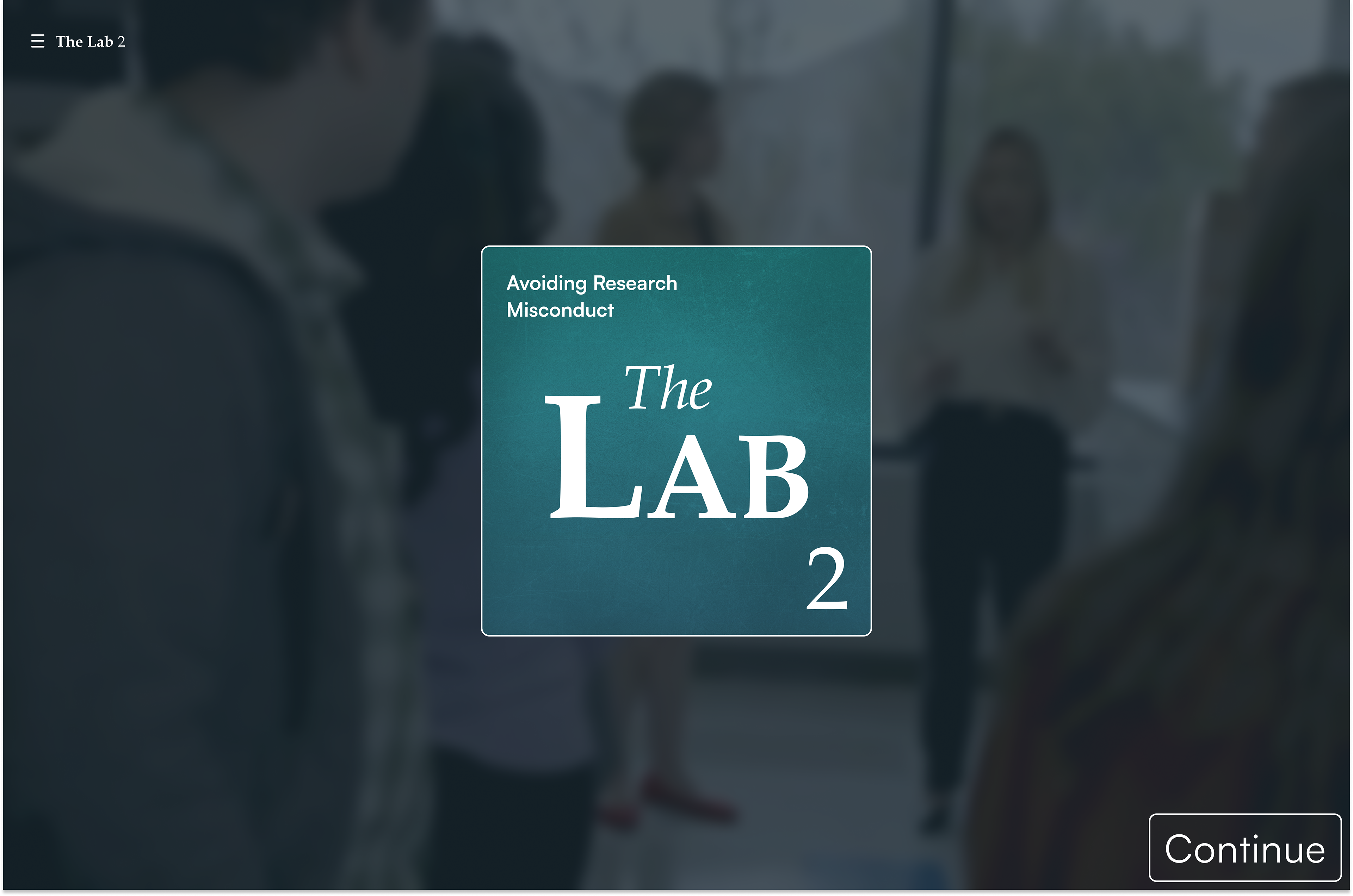
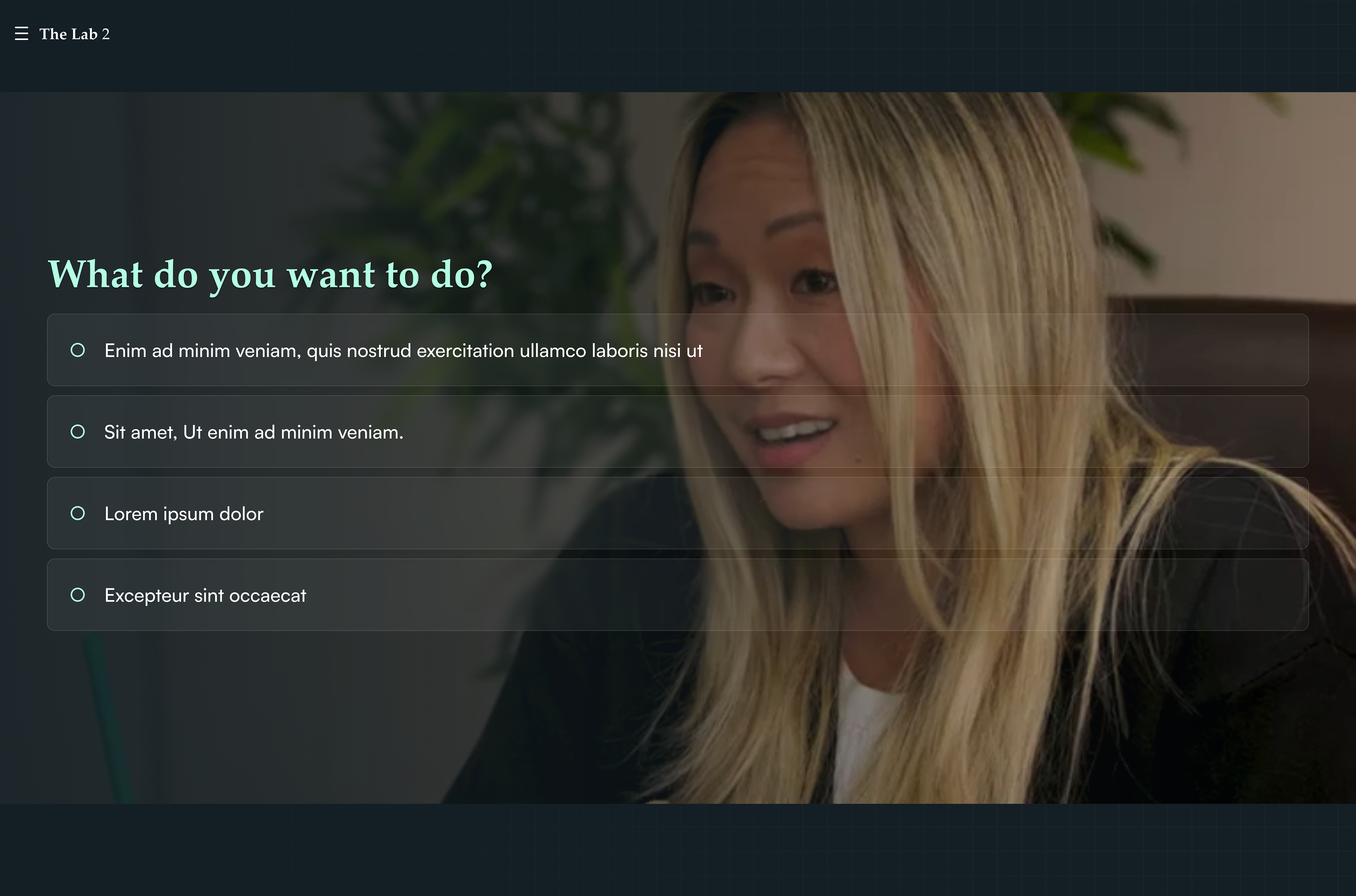
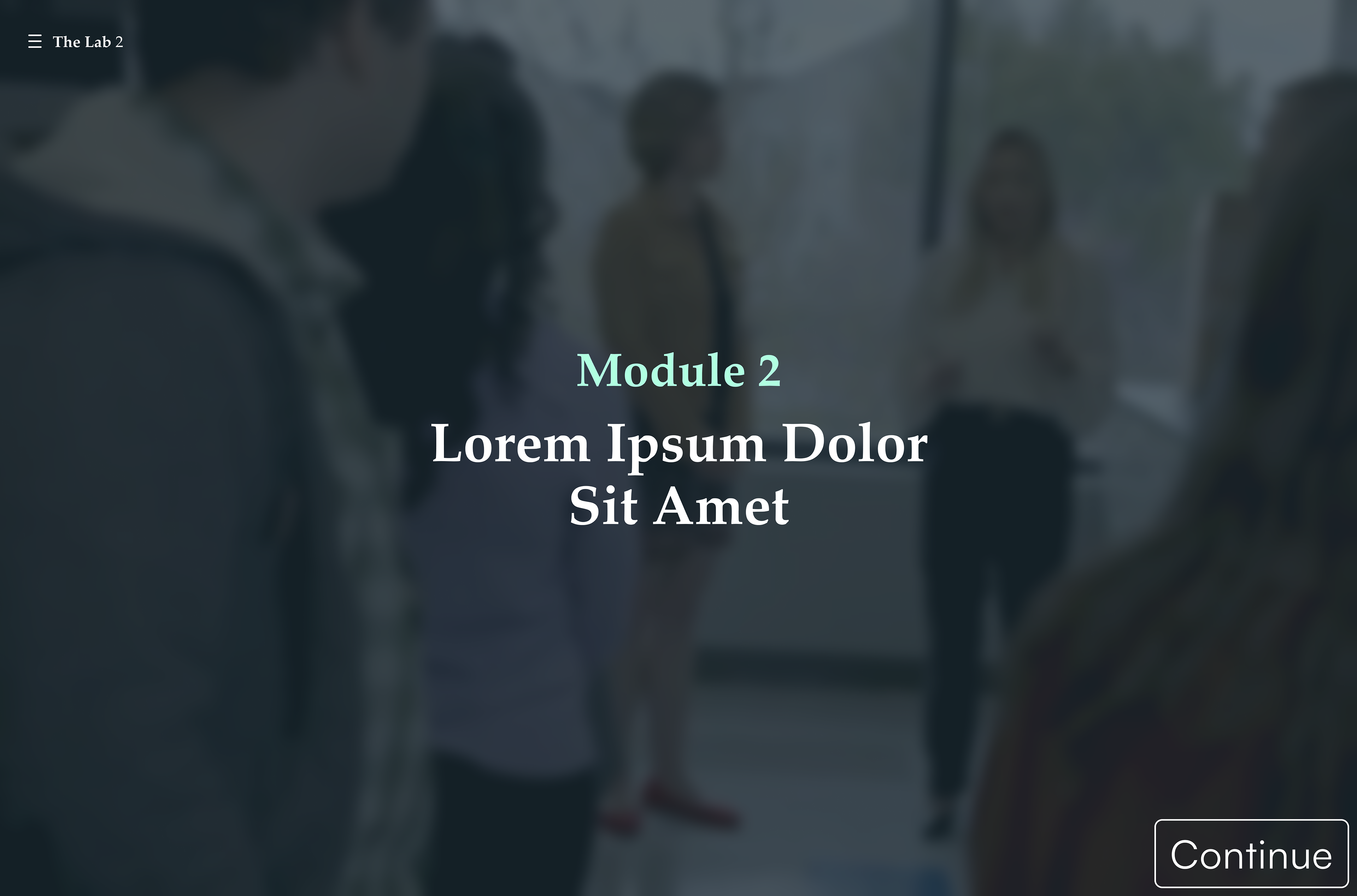
The following screens capture the visual and UX direction established for The Lab 2. Each layout was designed to feel modern and precise, reflecting the clean, technical aesthetic of the program while keeping the learner experience clear and easy to move through.
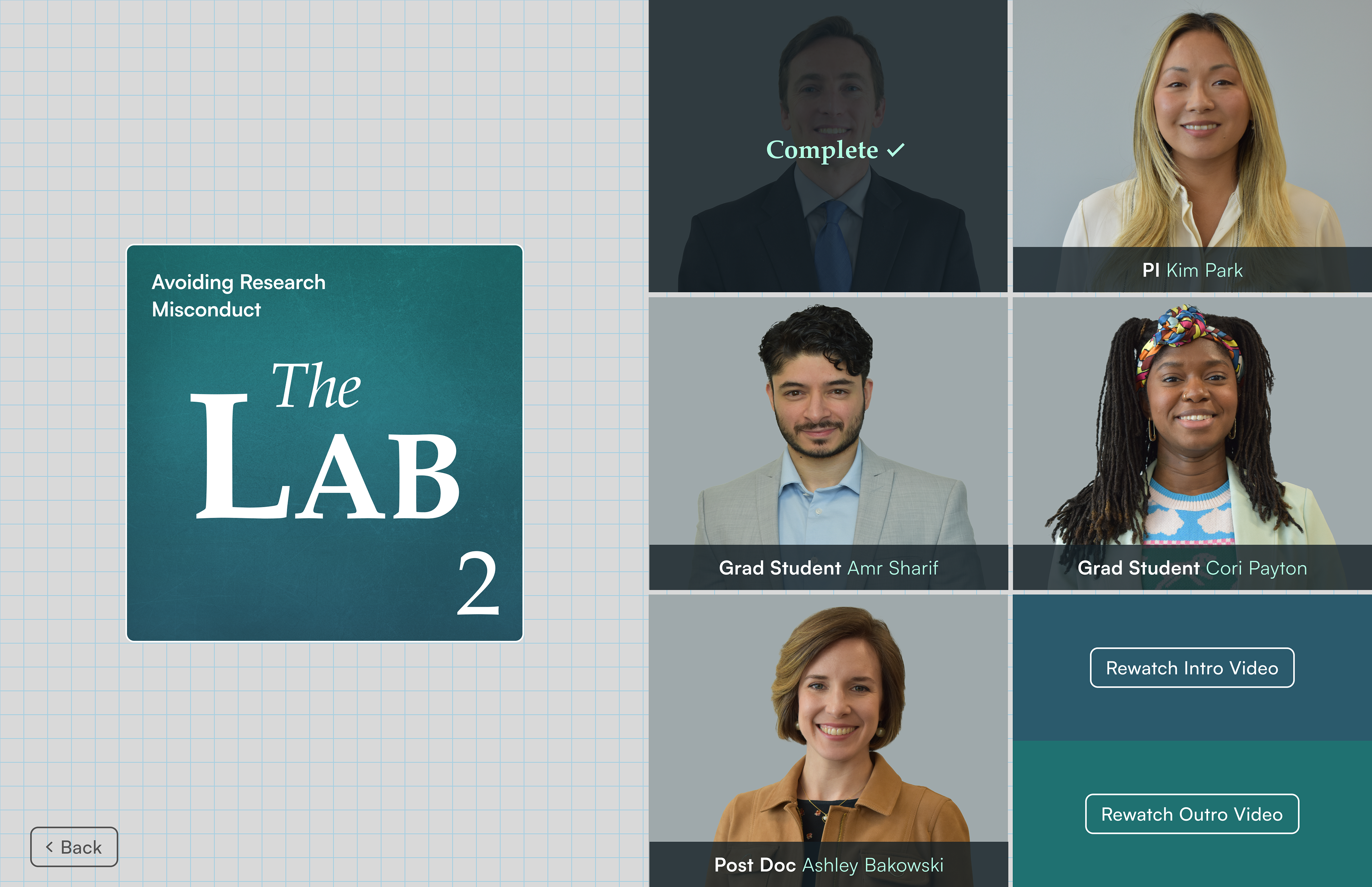
The menu was my favorite part of the project to design. I leaned into symmetry to create a layout that felt balanced and harmonious, aligning elements precisely and mirroring key components so the navigation felt structured and intuitive. There is something satisfying about a perfectly balanced layout, and in the context of a program built for scientists, that sense of precision and order felt right at home.
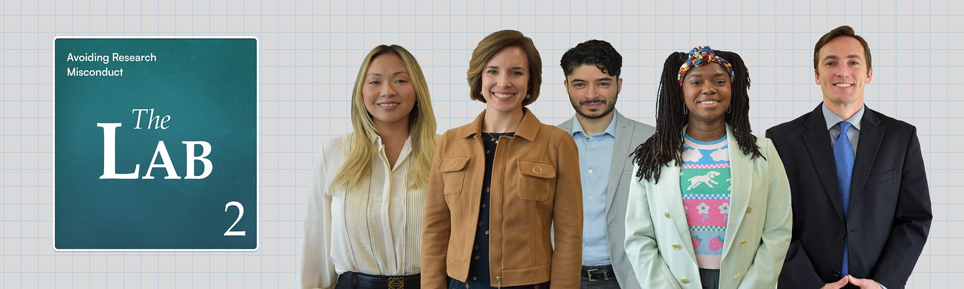
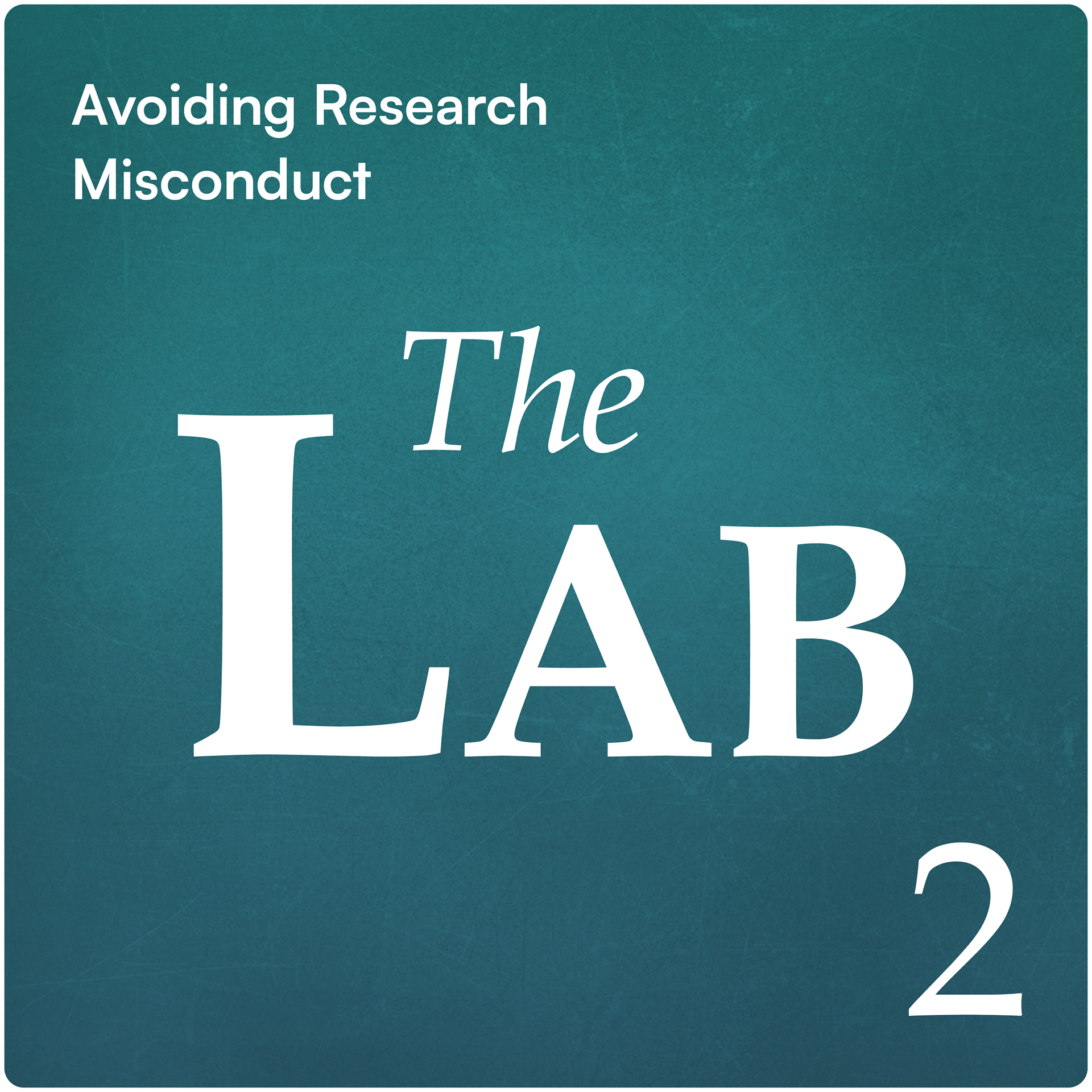
Logo Design
Because the program is aimed at scientists and researchers, I drew inspiration from the periodic table for the logo, centering the mark and placing the "2" at the bottom right in a nod to elemental notation.
The color palette of green and blue was chosen intentionally to convey trust, focus, and professionalism while keeping the overall feel visually inviting rather than cold or corporate. A graph paper texture in the background ties the identity back to the research process itself, evoking lab notes, data collection, and scientific methodology, grounding the logo in the world its audience lives and works in every day.
See It In Action
This walkthrough captures the full learner experience from start to finish, showing how the interface, navigation, and interactions come together in motion. Seeing the program flow as a whole gives a clearer sense of how each design decision contributes to an experience that feels cohesive, intuitive, and easy to move through.