My Approach
For me, visual communication is about making things make sense at a glance. I use layout, typography, and hierarchy to guide the viewer’s eye and highlight what matters most. Each design is built with a focus on clarity and flow, so the experience feels natural and easy to follow. I enjoy taking complex or detailed content and shaping it into something that feels intuitive, approachable, and visually engaging while still staying purposeful and clear.
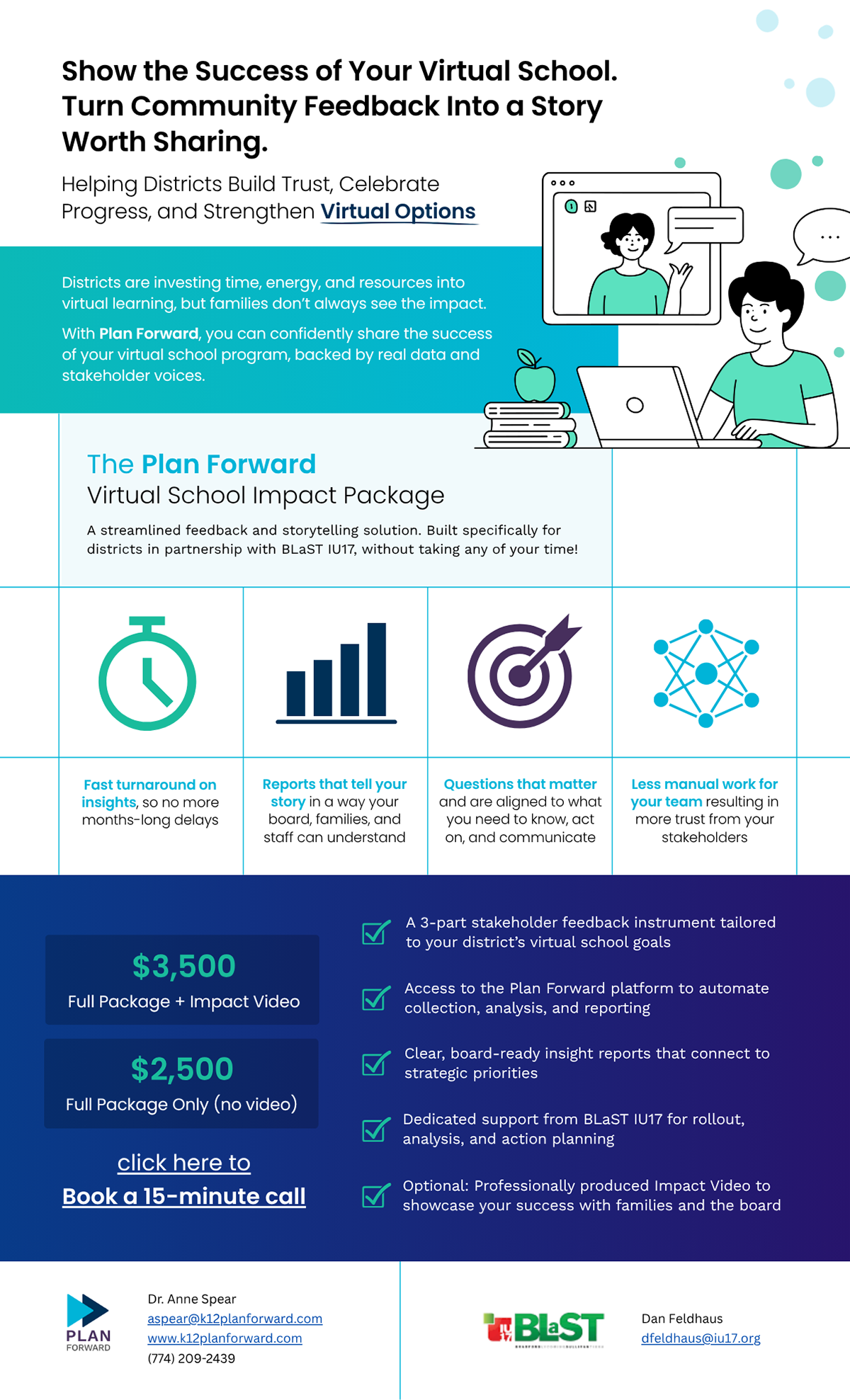
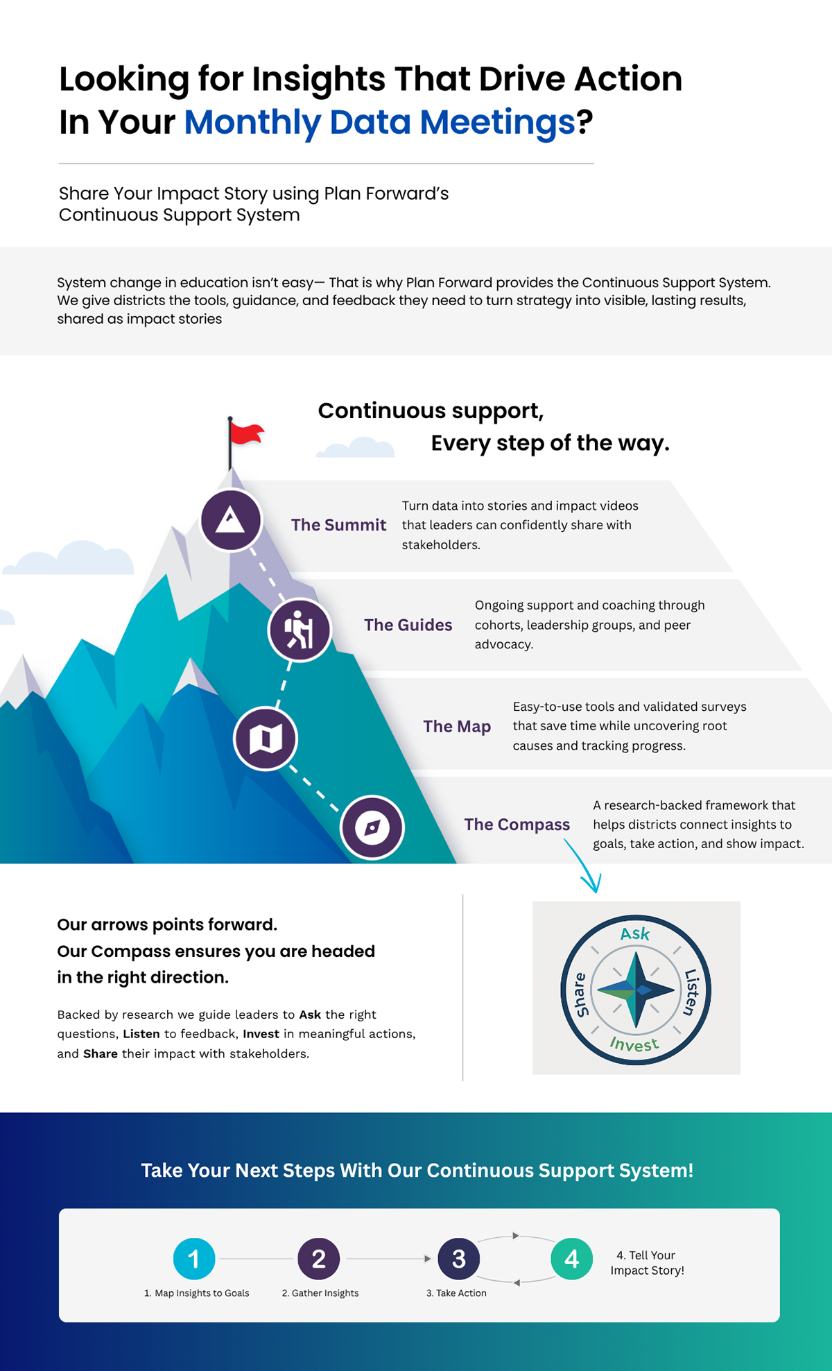
Infographic One Pagers
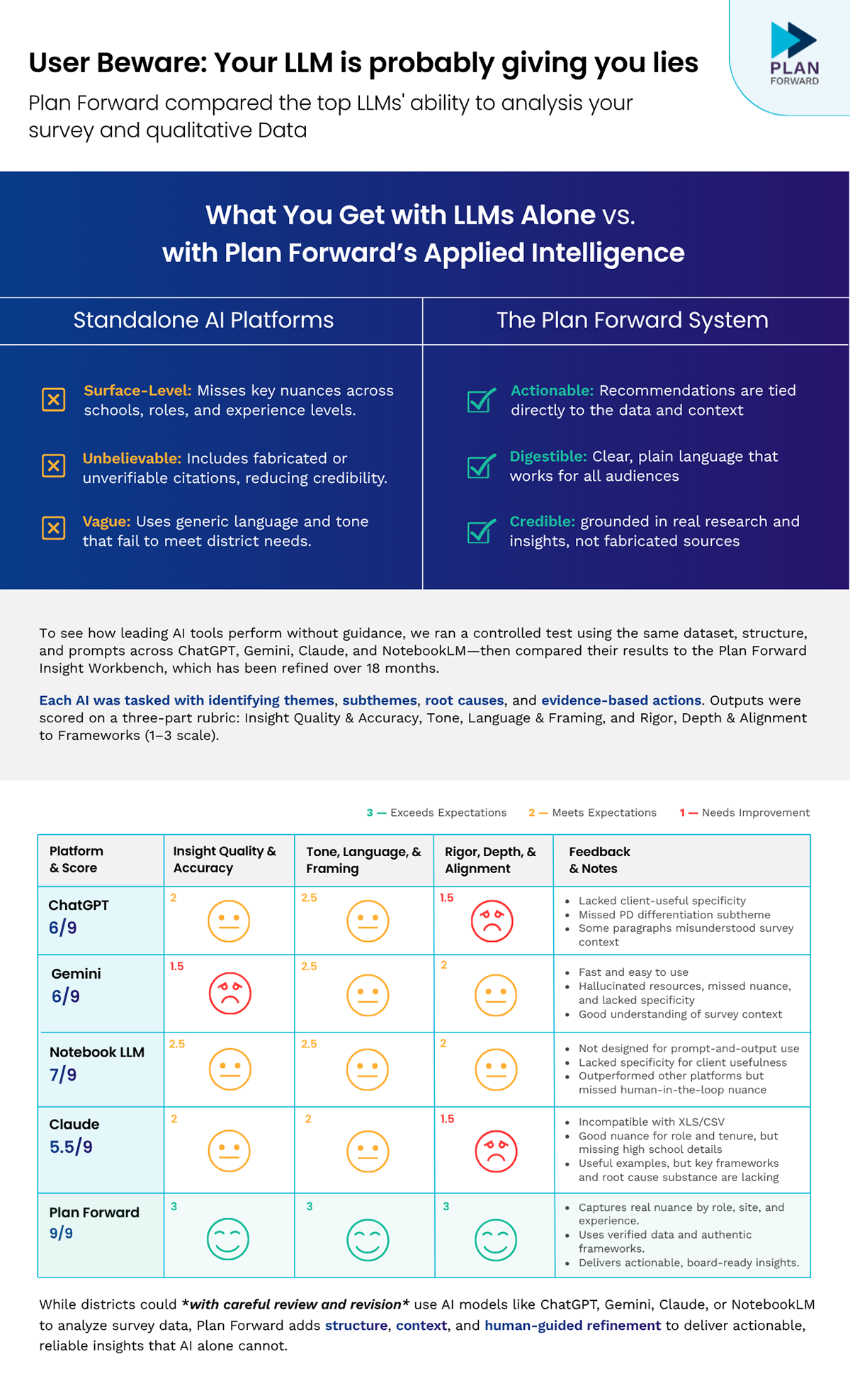
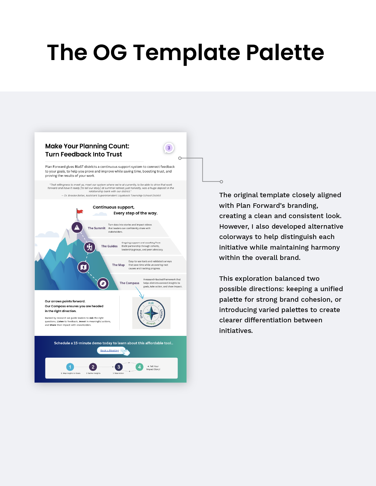
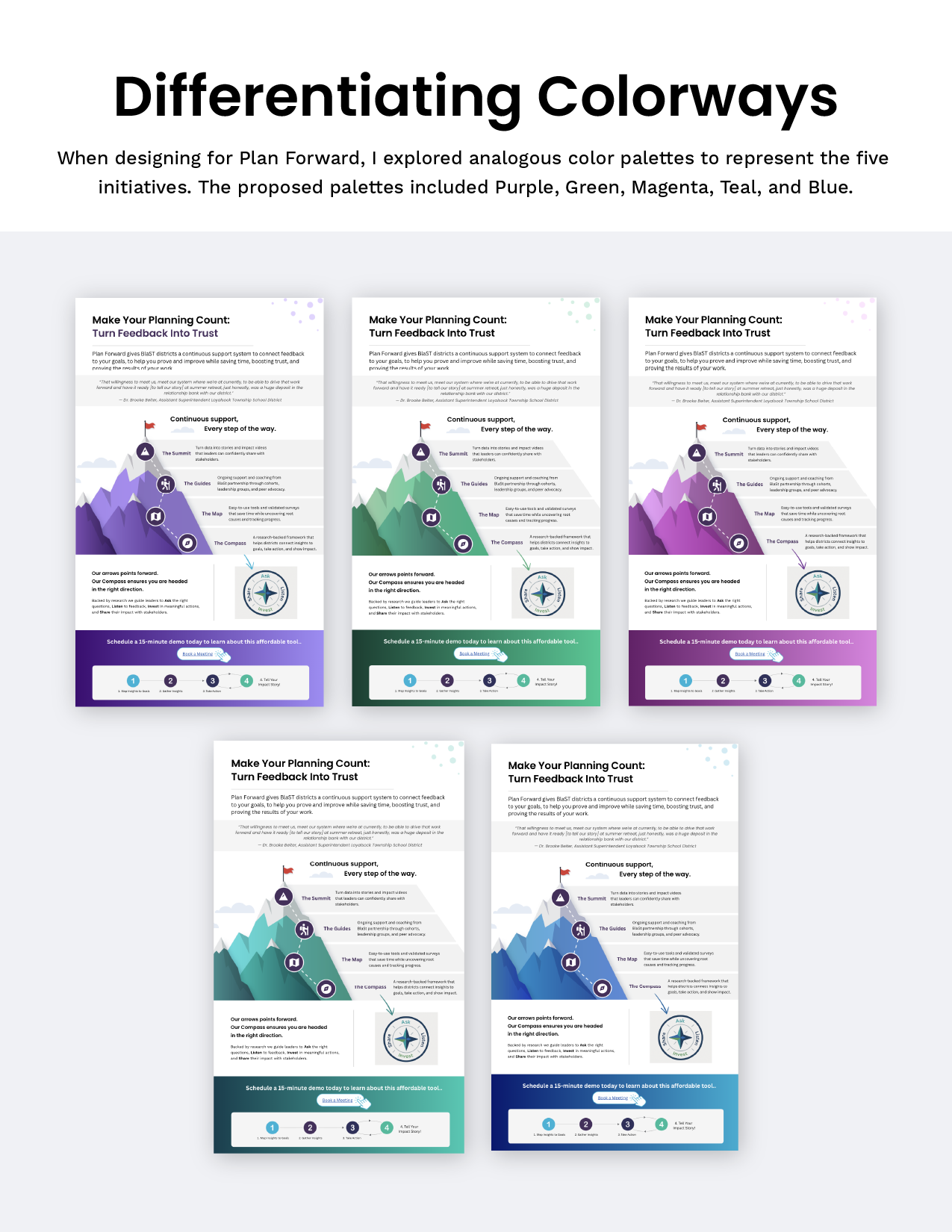
These one-pagers were created as part of Plan Forward’s brand refresh. I approached them with an infographic style to make the information more engaging and easier to digest. I designed custom illustrations, including the mountain graphic, in Illustrator, and explored analogous color palettes to distinguish different initiatives within the company. The goal was to create a clean, cohesive, and consistent visual system across all one-pagers.
Social Media Posts
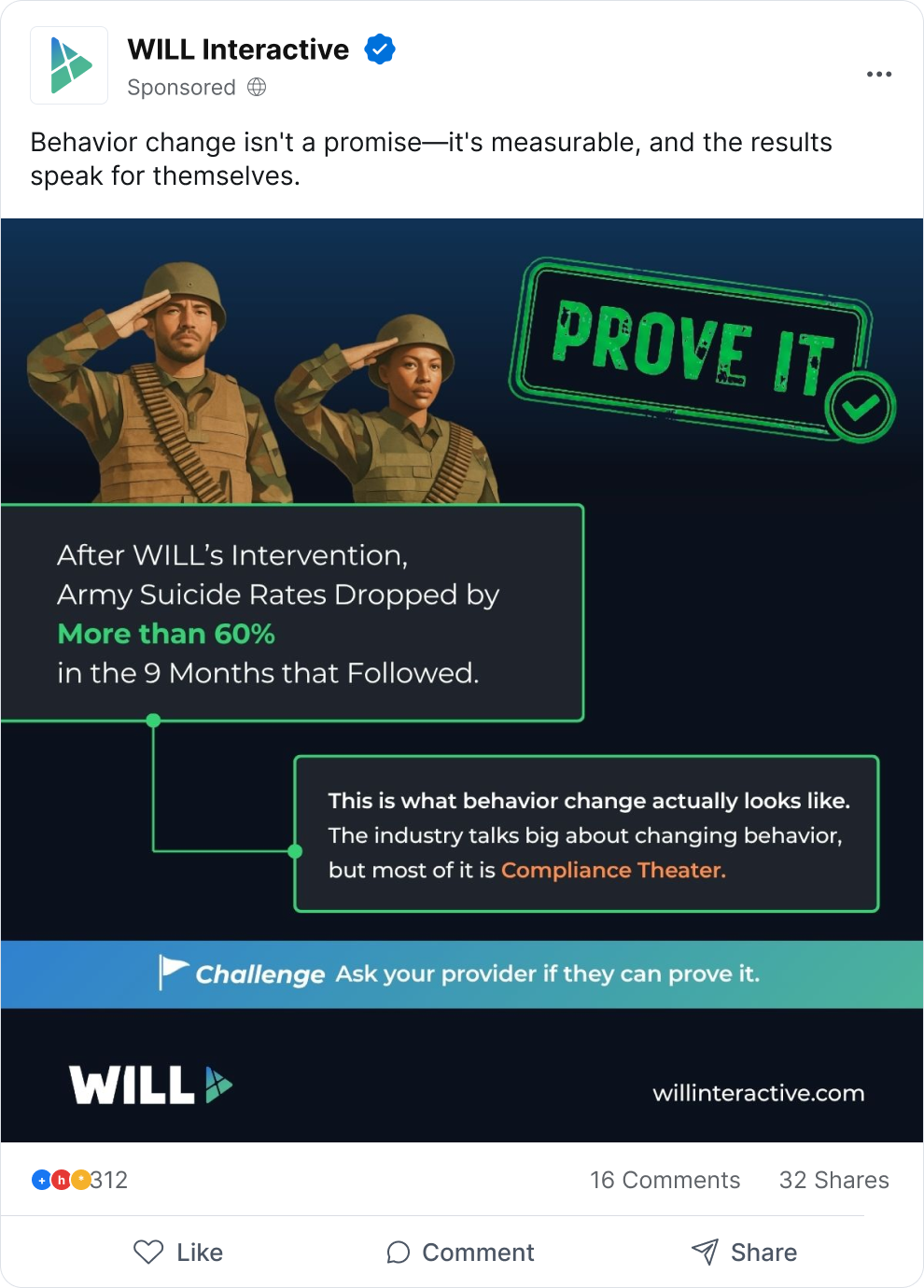
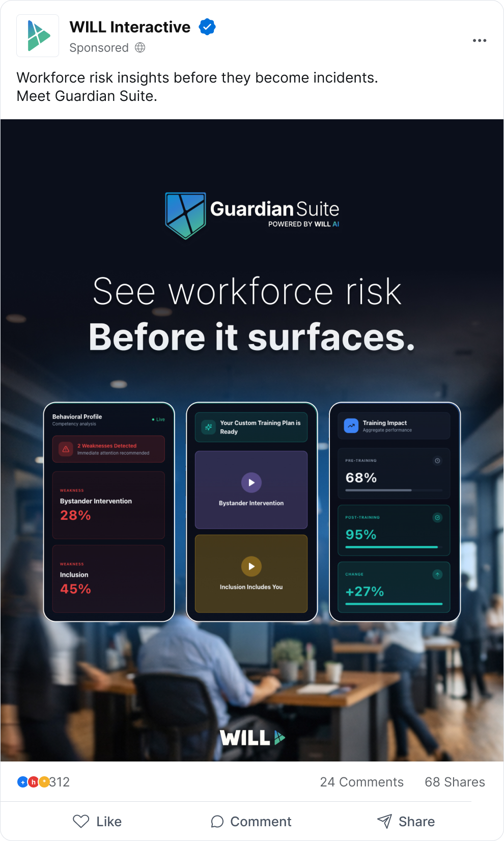
Here are a couple social media posts I created for WILL Interactive’s Guardian Suite initiative. The Guardian Suite materials feature a dark color palette with a high-tech aesthetic, which I carried through into the social media designs. I kept the text minimal and used clear typographic hierarchy to guide the viewer’s eye toward the most important information first.
Business Cards
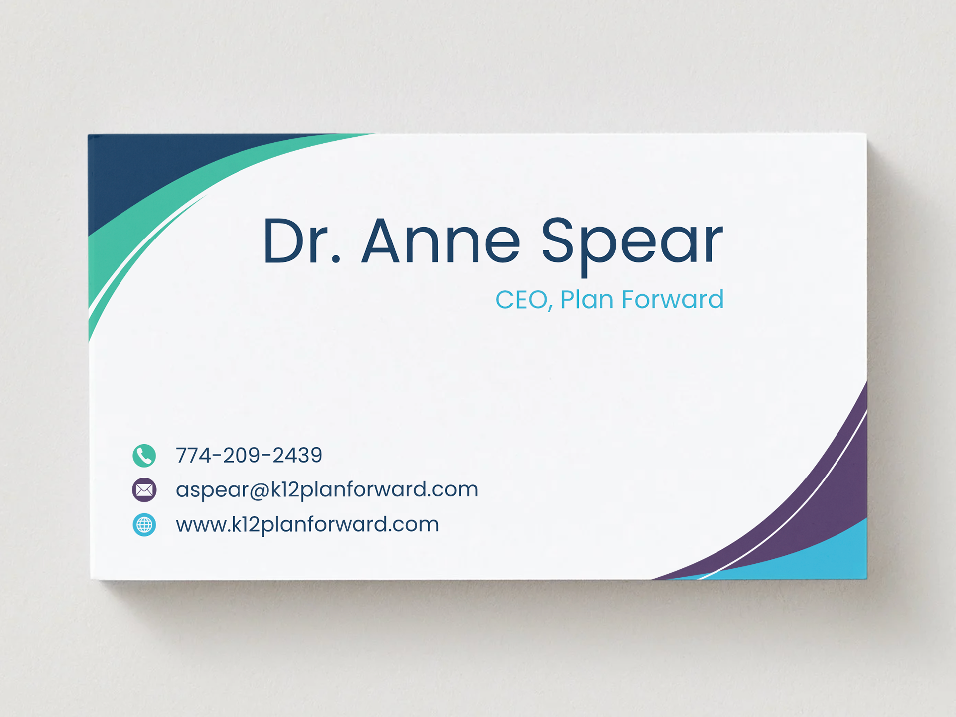
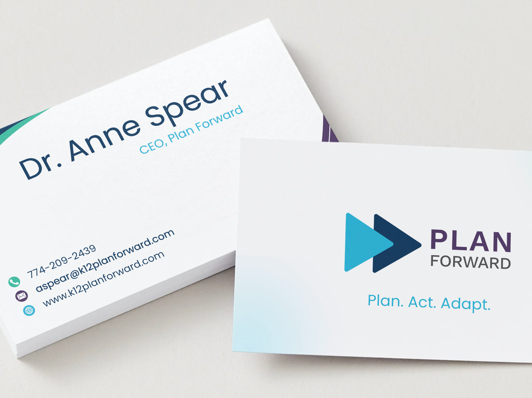
These business cards were created as part of Plan Forward’s rebranding project. The goal was to keep the layout simple and free of distracting elements, allowing the key information to stand out clearly.
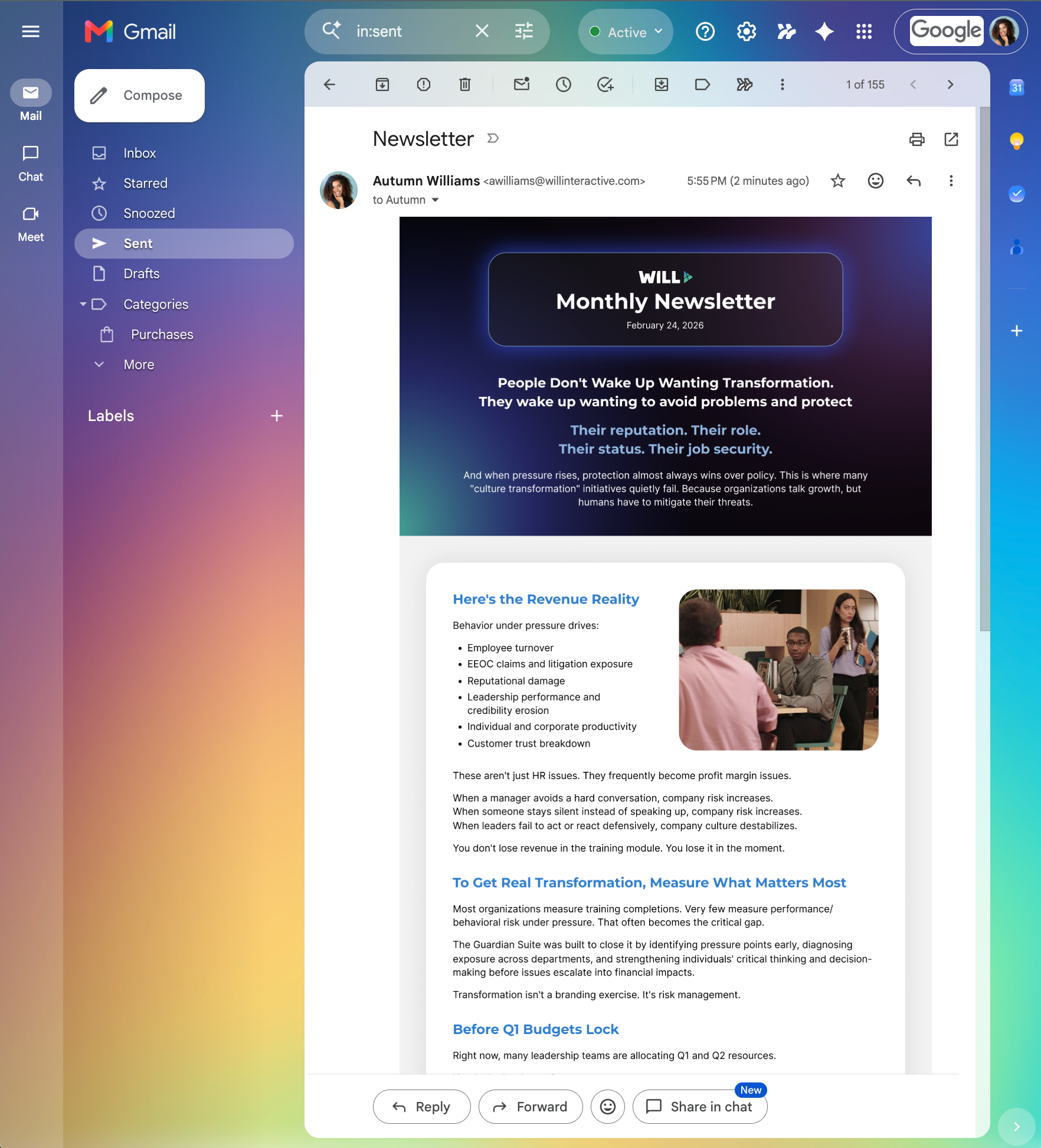
Email Newsletters
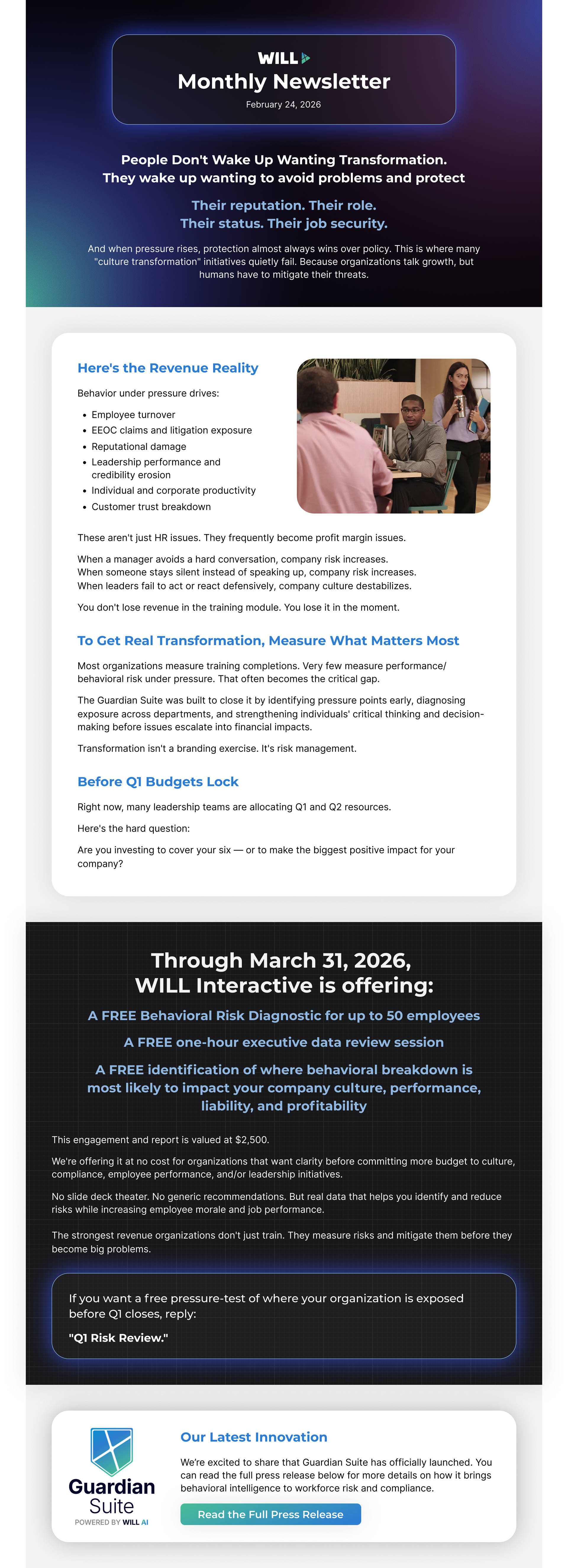
I created this newsletter in Figma as a reusable template for WILL Interactive to use for their monthly communications. The design was intentionally kept simple and flexible, allowing the marketing team to easily update content each month without disrupting the layout.
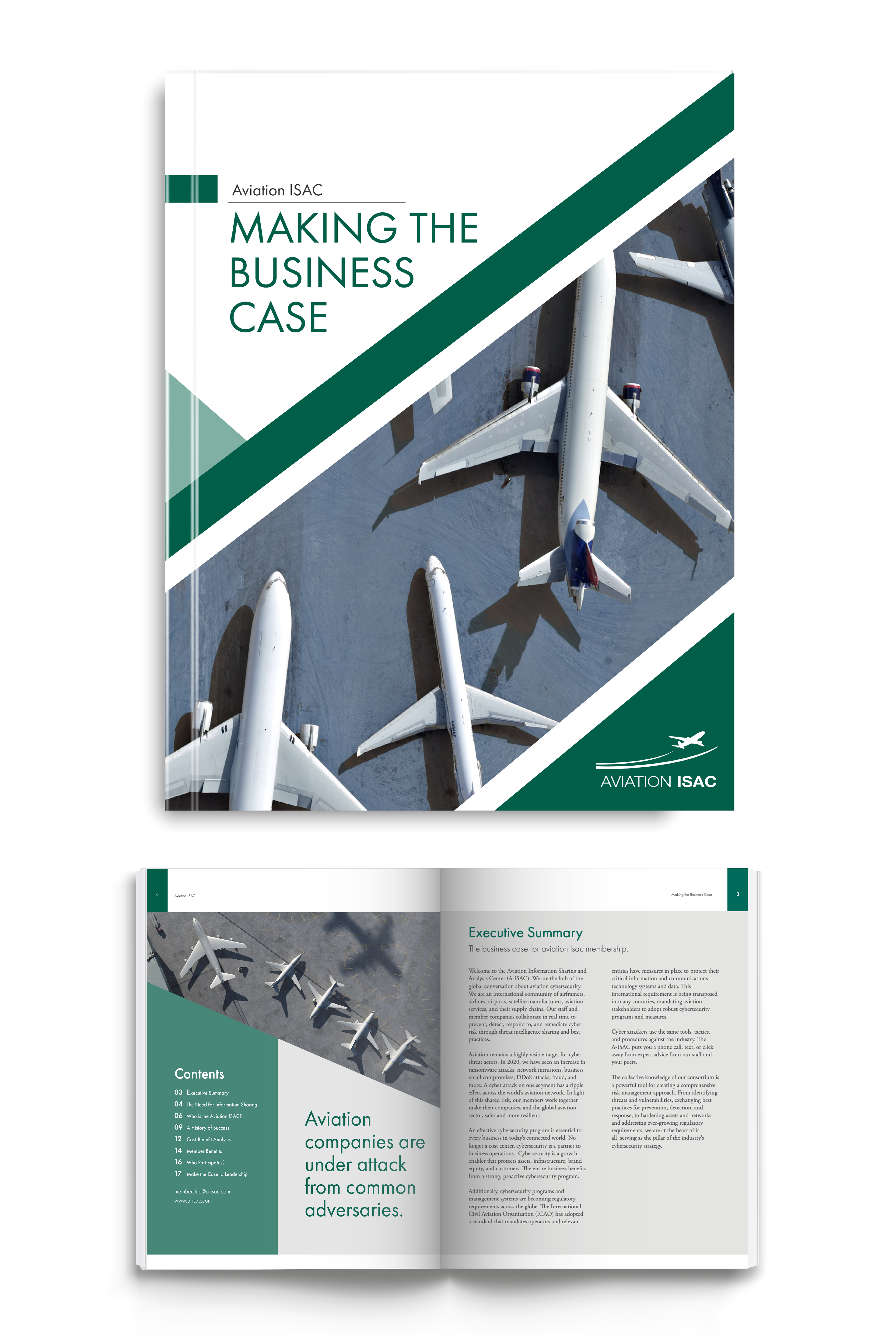
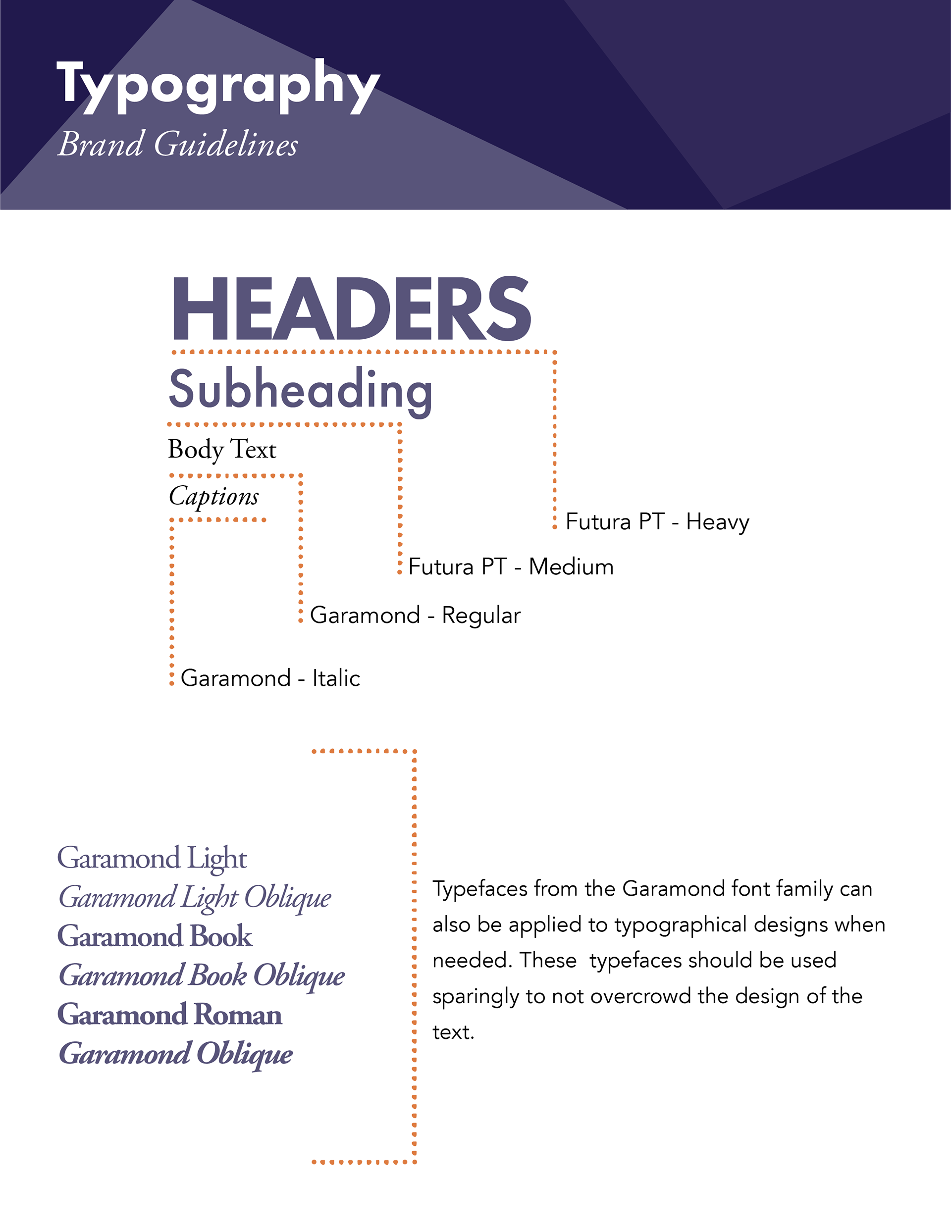
Editorial Design
This booklet cover and chapter section were created for Aviation ISAC. Drawing inspiration from the geometric structure of aircraft and the organization’s focus on aviation cybersecurity, I incorporated abstract lines and triangular shapes throughout the cover and chapter pages. I also included typography guidance, outlining the selected typefaces to ensure consistency across the overall design.