

A mini walkthrough of the training, showing a quick playthrough of one module to give you a feel for the overall experience.
AIG Personal Conduct Training
WILL Interactive was commissioned by AIG to develop a personal conduct training program, and I led the UX and UI design as the sole designer on the project. Working within AIG's brand guidelines meant designing within a restrained palette of blue, grey, and white, a limitation that ended up being a strength. AIG's identity leans into clean lines and a polished, corporate aesthetic, so rather than working against those constraints I leaned into them, creating an interface that felt like a natural extension of the brand. The result is a training experience that feels cohesive and professional, reflecting both AIG's visual standards and WILL Interactive's commitment to making training feel worth engaging with.
Understanding the Brand
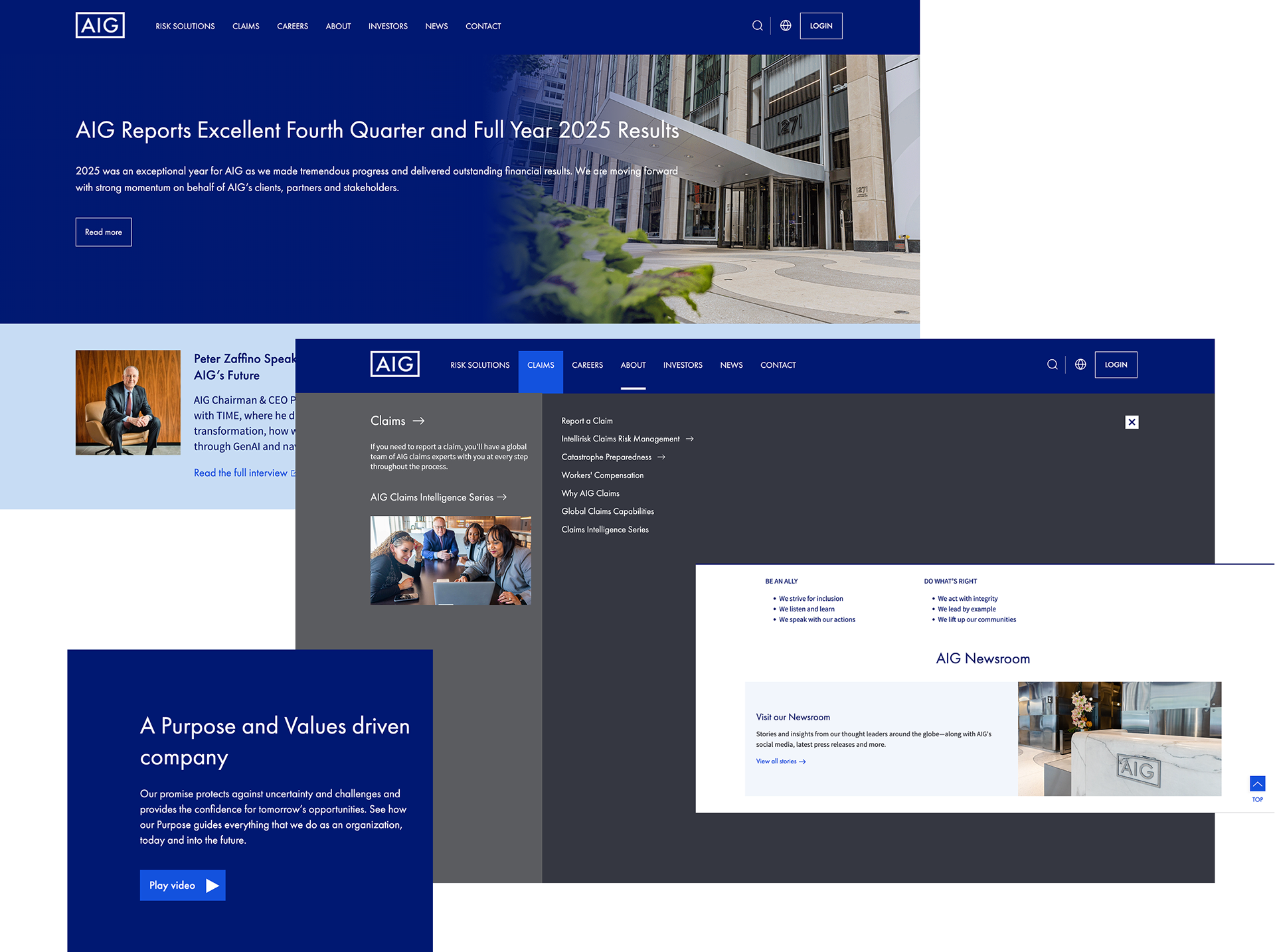
Before designing the training, I spent time researching AIG’s existing brand and visual style. I looked at their website to get a better understanding of how they use color, typography, imagery, and layout across their digital presence. This helped me create a training experience that felt consistent with the AIG brand while still giving the program its own visual identity.
Figma Wireframes
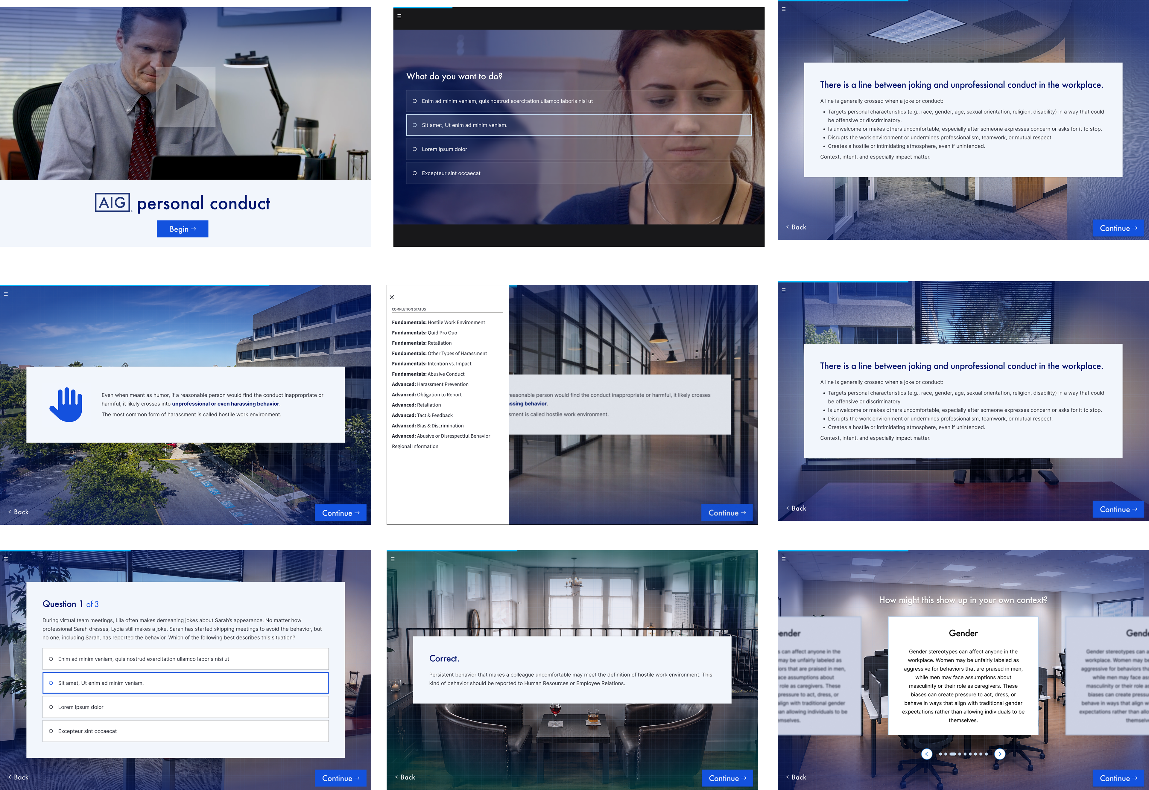
I created the wireframes based on my research, the training requirements, and my understanding of AIG’s employees and their needs. I considered user personas and explored which design approach would best suit the target audience. After going through several rounds of drafts and experimenting with different layouts and ideas, I refined the designs using feedback from the team. Once our team received approval from AIG, we moved forward with developing the program using these final wireframes as its foundation.
A Unique Look for Every Episode
I also created unique splash screens for each episode using photography I took on set during filming. The Fundamental modules used a clean white background, while the Advanced modules featured a dark grey background with a yellow button to help them stand out from the rest of the training. The yellow was the only color that stepped outside of AIG’s established brand palette, but I felt it gave the Advanced modules a stronger visual identity and made them easier to distinguish. AIG loved the yellow and ultimately approved it as part of the final design.

Text Message Prototype for the Film
One section of the training involved a character being harassed through text messages. I was responsible for designing the text message interface that would appear on the actor’s phone during the scene. I created the screens in Figma to resemble an iMessage group chat and turned the design into a working prototype that the actor could interact with on their actual phone. This allowed the text messages to appear and function naturally during filming instead of being added afterward.
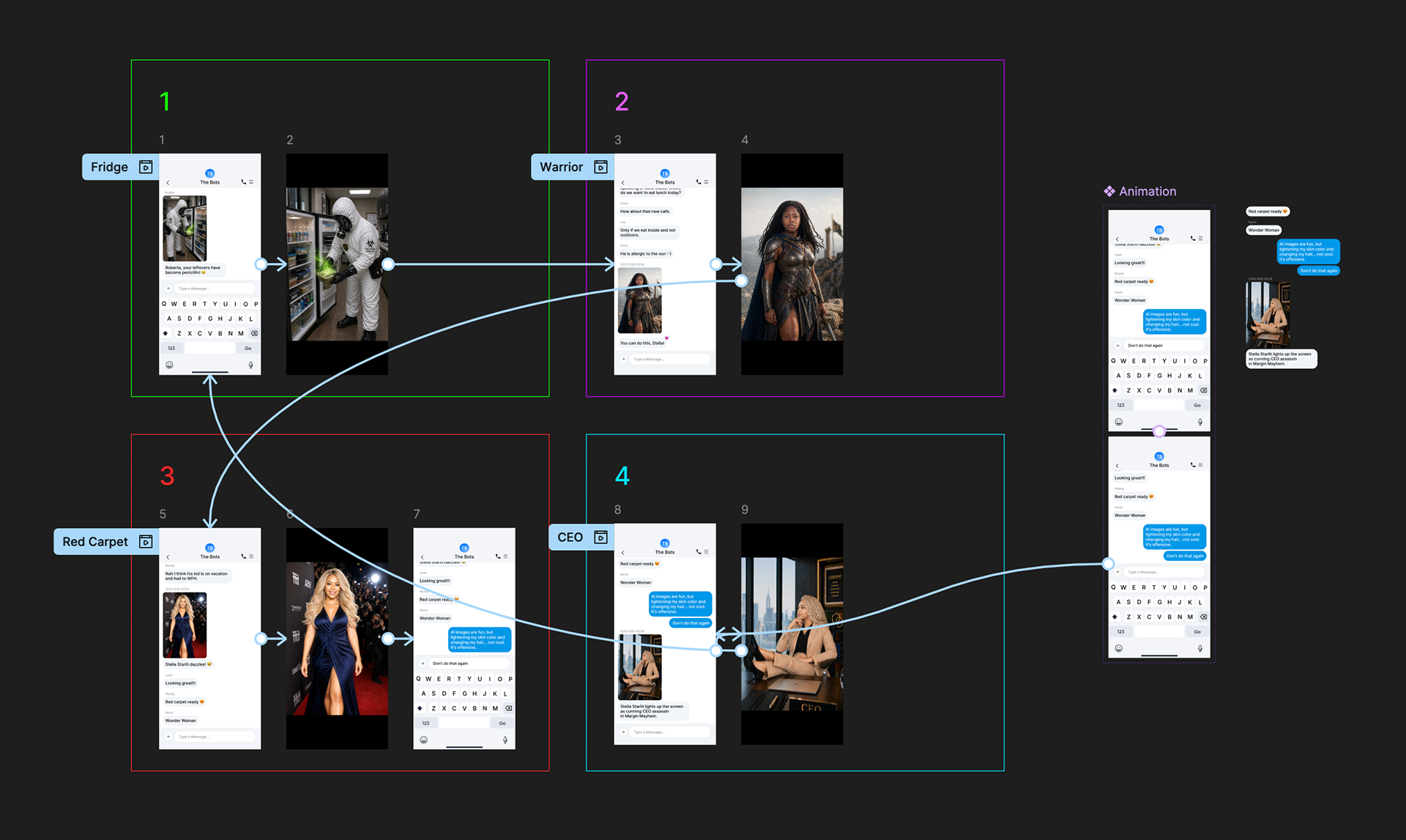
Play the video to see the text message prototype in action.
This is a scene from the finished training showing the text message prototype being used. The prototype was displayed on the actor’s phone and interacted with in real time, allowing the text messages to feel like a natural part of the scene.